Why One Product Page Can’t Serve Two Masters
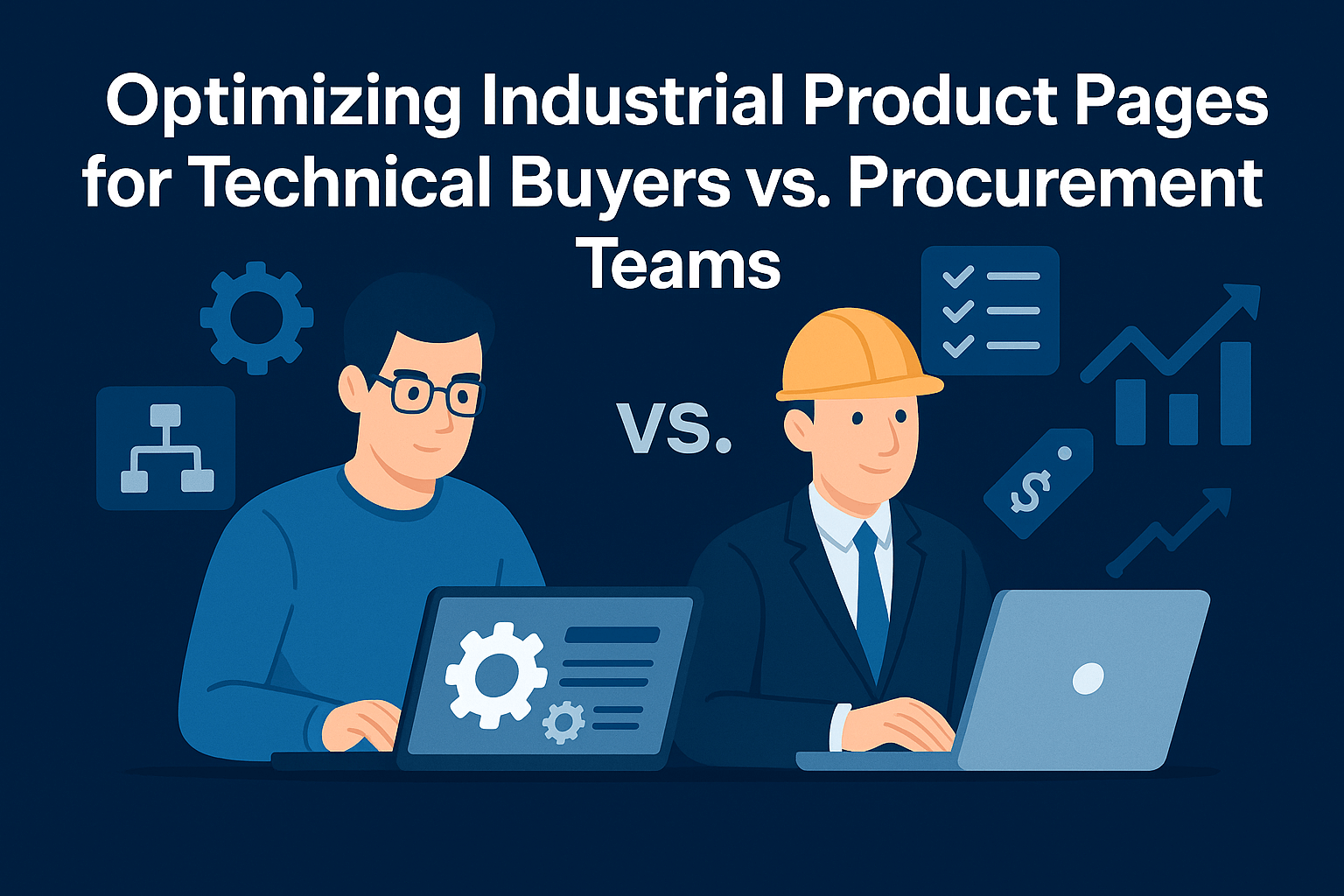
The modern industrial product page is under quite an attack, not from competitors, not from Google’s ever-changing algorithm, but from within your own buyer’s organization. Because when a technical lead and a procurement officer land on the same product page, they’re not looking for the same thing. And most pages, frankly, don’t satisfy either.
An engineer wants to validate tolerances, double-check compatibility with existing systems, and download a CAD model to simulate the fit before considering purchase. Meanwhile, procurement is searching for price justification, lead time visibility, and risk-minimizing purchase terms. Both roles have decision-making power. Both shape the deal. And if either one can’t find what they need, the conversation stalls, or worse, disappears into offline friction, endless quote emails, or a vendor that feels easier to buy from.
The buyer journey is fragmented, non-linear, and multi-headed. And your product page, often the landing page for both engineers and procurement, is the only place where every stakeholder collides.
That’s what this guide is about: how to design industrial product pages that serve both the technical brain and the financial decision-maker, without overwhelming either. We’ll show you what each role needs, how to deliver it without clutter, and which platforms and tools support this dual-track approach at scale.
Because in industrial ecommerce, winning the deal isn’t just about having the right product.
It’s about making it shockingly easy for every buyer to say yes.
The Personas Behind Every Industrial Purchase
Industrial ecommerce is orchestral. Every order, especially for complex or high-value products, is shaped by multiple stakeholders who each bring different priorities, fears, and decision frameworks to the table. And yet, most ecommerce systems, and the product pages that power them, treat all buyers as if they think the same way.
They don’t.
One half of the equation is the technical buyer. This might be an engineer, a plant operations lead, or a maintenance supervisor. Their concerns are precise, unforgiving, and deeply tied to real-world applications. Will this component survive the conditions it’s going into? Is it compatible with what’s already installed? Does it meet regulatory or safety codes? They want to verify part numbers, download CAD files, and compare spec tolerances. They don’t want fluff. They want proof.
The other half is the procurement team. These are the people who hold the PO power. Their job is to manage cost, risk, and timing. They care less about whether the bolt pattern aligns with last year’s model, and more about how long it will take to arrive, what it costs at bulk volumes, whether it’s covered under existing vendor terms, and what documentation is available for legal or accounting audit.
Both personas are legitimate. Both are essential to the sale. But their needs rarely show up at the same time, and rarely fit inside the same screen. That’s the conflict most industrial product pages ignore: trying to serve two masters with one undifferentiated content block. And the consequences are measurable.
When technical buyers can’t self-validate specs, they bounce or flood support with questions. When procurement can’t see pricing logic or lead time certainty, they stall or kick the request into a quoting loop. And when both are underwhelmed, they don’t complain. They just pick up the phone and call someone else.
This isn’t about personas in a marketing slide. It’s about real humans, with real jobs to protect, hitting your site and wondering: Did they build this page for me, or for someone else?
In the next section, we’ll break down exactly what goes wrong when you try to merge these needs blindly, and what it costs you in the long run.
Why Generic Online Stores Don’t Work for Industrial Buyers
Most ecommerce platforms were built for consumer retail. They’re optimized for an online shopping experience that rewards inspiration, impulse, and high-frequency behavior. But industrial buyers don’t browse. They validate, compare, and negotiate. They’re not there to be sold, they’re there to confirm.
This disconnect becomes dangerous when industrial businesses rely on those same default ecommerce website structures to serve engineers and procurement officers. At first glance, a single product page feels efficient. One place to list everything. One layout to maintain. One SEO target. But in practice, that efficiency comes at a steep cost: conversion leakage, support volume spikes, and sales cycle friction that compounds quietly in the background.
Here’s how it usually plays out.
An engineer lands on the product page. They scroll through product images, skim the specs, maybe click to download a PDF datasheet. But they can’t filter by mounting orientation. The tolerance ranges are buried in a table that doesn’t match how they’re used to comparing options. And the CAD file? It’s not there. Or worse, it’s generic, not product-specific. So they either abandon the session or kick off an email thread: “Can you send me the STEP file for part #C-482 with the alternate flange?”
Meanwhile, someone in procurement shows up later, browsing independently. They see the same product, same layout. But pricing is vague or gated. No dynamic volume discounting. No clarity on lead times. No purchase terms visible. So they do what procurement professionals are trained to do: they delay. They request a formal quote. They email a competitor. Or they escalate to a preferred vendor who’s already in their system, even if that vendor’s product isn’t the best technical fit.
That’s the hidden cost. A generic online store structure pleases no one. You’re spending more on customer service to field spec questions that should’ve been self-served. You’re dragging out sales cycles that could’ve closed in a day. And you’re forcing your own team to play translator between engineering and purchasing, when your site should’ve done that job for you.
Worse still, the damage is hard to measure directly. These site visitors don’t always bounce. Sometimes they linger. Sometimes they forward the page to five internal contacts. But the sale never closes, and no one tells you why. All your analytics show is time on page, not confidence in the decision from your website visitors. And that’s the real KPI industrial ecommerce should be tracking.
To fix this, you don’t need to split your catalog into two. You need to segment the experience, not the product. That means rethinking how you create product pages, not just by SKU, but by stakeholder need. And it starts with understanding what each persona wants when they land on your site.
What Engineers Look For: Detailed Descriptions Without the Clutter
When an engineer arrives on your product page, they’re not browsing. They’re validating. They’re looking for frictionless access to the information they need to confirm that your product fits their real-world use case. That means going beyond the marketing gloss and generic product descriptions, and into functional clarity. Product specifications like tolerances, materials, compliance data, and compatibility notes are the language of engineering decision-making. For engineers, vague or overly simplified product descriptions erode trust; what they need are spec-driven details that speak their language.
But here’s the nuance: engineers don’t want to hunt. If you bury a critical detail three layers deep in a PDF, they assume your product isn’t serious. If your CAD files are generic, unlabeled, or behind a lead gate, they’ll bounce to a supplier that doesn’t waste their time. If your site structure forces them to open six tabs just to compare the same part across voltages or coatings, they’ll abandon it altogether.
The good news? You don’t need to cram every engineering detail into the first screen. The key is structured clarity, content that adapts as they explore.
Imagine this: a tabbed interface where “Technical Specs” lives separately from “Pricing & Terms,” and within the technical view, spec tables are filterable by variant. Material properties shift dynamically based on selected dimensions. A “Download Center” gives one-click access to BOMs, drawings, and safety sheets, no forms, no emails, just instant confidence. And if they select a config that violates a known constraint? A gentle validation message appears, just like their CAD tools would flag it.
The best implementations go even further. Using metafields or headless components, some brands create “engineering views” that highlight compatibility with adjacent products, show real-time inventory for commonly paired parts, or visualize assemblies in-browser. You’re not just selling a part, you’re helping the engineer simulate the outcome.
Because when engineers feel understood, they stick around. When they feel empowered, they specify your product in the project. And when that happens, procurement follows.
What Procurement Needs to See
Procurement doesn’t scroll for sport. They’re not here to validate specs, visualize enclosures, or dream in 3D renders. Their job is risk management. Their priority is documentation, cost control, and contractual clarity. And their time is limited.
So when a procurement officer lands on your product page, often forwarded by an engineer or bookmarked during vendor comparison, they’re immediately scanning for three things: price transparency, delivery feasibility, and compliance assurance.
The moment any of those is missing or unclear, the warning lights go off.
“Price hidden behind a ‘Request Quote’ form? That signals friction. Lead time marked as ‘Call for Availability’? That signals risk around product availability and fulfillment confidence. Terms and conditions only visible after checkout? That signals exposure. And in most industrial organizations, procurement people aren’t paid to explore their way through uncertainty. They’re paid to eliminate it.
The friction compounds when product pages are written exclusively for engineers. Procurement doesn’t want to wade through NEMA charts to find your Net 30 terms. They don’t care that you list 12 materials per part if there’s no dropdown showing what’s in stock. What they need is clarity, fast: unit price (or volume pricing brackets), shipping timeline, return policy, documentation, and whether this product is already on their approved vendor list.
The most effective ecommerce sites treat procurement not as an afterthought, but as a parallel user journey.
That might mean using conditional logic to show different content to logged-in purchasing agents, like negotiated pricing or contract-specific SKUs. It could mean dedicating a persistent section on the product page for “Ordering & Terms,” with dynamic content that adapts to customer tier or account permissions. Or it could be as simple as giving procurement the ability to download all relevant purchasing documentation, W-9s, certificates of conformance, tax exemption info, without having to contact sales.
Just like engineers don’t want to call for spec sheets, procurement doesn’t want to email sales reps for policy PDFs. Every time they have to wait, someone else earns the PO.
So if you want the sale to move forward, you have to remove doubt before it creeps in. That means giving procurement what they need, exactly when they need it, on the same page, in a structure that respects their mindset.
Designing a Split-Mind Product Page That Still Converts
You don’t need two product pages. You need one page with two minds.
The goal isn’t to silo engineers and procurement into separate flows, it’s to create a unified product experience that adapts to each persona’s priorities. When executed well, this approach becomes a strategic differentiator. Your site isn’t just easier to navigate; it becomes a tool that accelerates alignment across stakeholders and actively helps engage customers throughout the decision process.
So, how do you pull it off?
It starts with visual hierarchy. Engineers shouldn’t have to scroll past purchasing policies to get to spec data, and procurement shouldn’t be forced to parse tolerance ranges just to find your lead times. The solution isn’t to bury one persona’s needs in favor of another’s; it’s to design a layered interface where each visitor can zero in on their objective without being distracted by irrelevant noise.
Use tabs, accordions, toggles, or anchored sections to separate the content by role. Think of it as a product narrative that branches based on the user’s intention. When an engineer clicks “View Specs,” the page expands to reveal drawings, electrical limits, performance data, CAD files, and certifications. When a procurement manager clicks “Ordering Info,” they get pricing logic, tiered discounts, delivery timeframes, warranty terms, and downloadable vendor documents.
And here’s where ecommerce platforms often fall short: most out-of-the-box product page templates treat every user as identical. But industrial sales rarely work that way. That’s why going beyond the native template—using metafield-driven logic or a headless frontend—is often the only way to deliver differentiated content at scale.
You might personalize based on login status: show negotiated pricing, contract SKUs, or custom compliance notes only to authenticated procurement users. Or use geo-targeting to surface region-specific certifications or taxes. Some manufacturers even add a “Buyer Role” selector above the fold, letting users choose between “Engineering View” and “Procurement View,” which reshapes the page layout dynamically in real time.
Whatever the method, the principle is the same: design for intent. Don’t force procurement to act like engineers or vice versa. Respect their cognitive load, their decision lens, and the workflows they operate in.
Because the faster each role gets to clarity, the faster they agree internally. And that alignment is what unlocks the PO.
Building the Right Stack: Flexibility Without a Full Rebuild
To deliver a dual-experience product page that serves both engineers and procurement without compromise, you don’t need to burn down your ecommerce infrastructure. But you do need to outgrow the default templates.
Most industrial brands start with a traditional platform like Shopify, BigCommerce, or Magento. And to be clear, those platforms can handle the heavy lifting on catalog management, order processing, and pricing logic. The problem isn’t the foundation. It’s the rigidity of the frontend experience layered on top.
That’s where headless architecture comes in.
Going to a headless Shopify or headless BigCommerce doesn’t mean ditching your platform. It means decoupling the presentation layer (the part buyers interact with) from the backend logic (the part that manages products, inventory, and transactions). This gives you total control over what each user sees, when they see it, and how the information behaves in real time.
Let’s say you’re using BigCommerce. Its backend can still manage SKUs, customer groups, and ERP sync. But with a headless frontend, whether it’s built on Next.js, Gatsby, or a PWA framework, you can design a product page that conditionally renders engineering specs only when needed. You can tailor the procurement interface without touching the SKU structure. You can inject dynamic BOM data, allow variant-level document downloads, and pull real-time availability from your ERP, all in one flow.
On Shopify, you can achieve a similar result with Hydrogen or Storefront API integrations. On Magento, headless is practically a survival strategy for UX. Even no-code and low-code middleware platforms now allow you to layer custom components on top of existing catalogs using embedded JavaScript or iframe logic, ideal for MVPs or mid-market teams.
The key decision isn’t which platform you’re on. It’s whether your stack allows you to speak differently to different stakeholders within the same product experience. That’s the unlock.
It’s what makes an engineer say, “I trust this data.” And a procurement officer says, “I’m ready to issue a PO.” On the same product page. At the same moment.
Implementation Roadmap – From Static Pages to Stakeholder-Aware Experiences
Transforming your product pages from static, one-size-fits-all templates into intelligent, stakeholder-aware experiences is an architectural shift. But it doesn’t have to be disruptive. The roadmap is clear, and it can be implemented incrementally, without halting your current operations or requiring a complete replatform.
Transforming your product pages from static, one-size-fits-all templates into intelligent, stakeholder-aware experiences is an architectural shift. But it doesn’t have to be disruptive. The roadmap is clear, and it can be implemented incrementally, without halting your current operations or requiring a complete replatform.
Start With Intent: Map What Each Stakeholder Needs
You need to map the buyer roles you’re serving and outline what each one needs to see to take action. Sit down with your sales and support teams. Ask: What are engineers constantly emailing about? What documentation do procurement teams request after checkout? Your goal here isn’t just to gather requirements, it’s to define intent paths. What do each of these personas want when they visit the product page? What questions are they trying to answer?
Architect for Role-Relevance, Not Just Readability
Once you know what each persona needs, you can start structuring the content accordingly. For engineering content, think specifications, technical drawings, CAD files, component logic, certification charts. For procurement—pricing logic, shipping details, compliance documents, terms, and approval cues. Each of these needs a home in your page layout. That doesn’t mean creating two separate pages. It means creating smart, role-aware containers that load the right content at the right time.
Choose a Platform That Can Flex With You
If your current CMS or ecommerce platform allows for metafields, custom templates, or frontend flexibility (e.g. Shopify with Hydrogen, BigCommerce with Stencil or a headless PWA), you can begin building logic-driven layouts that respond to login status, account type, or even role selectors. Don’t have developer bandwidth? Use middleware—tools like Shogun, Builder.io, or custom JS layers that give you dynamic components without rewriting your backend.
Wire the Pipes—Sync Your Data to Power the Experience
The power of a stakeholder-aware page is in its data sync. Your ERP must pass real-time inventory, availability, and contract-specific pricing. Your document management system should feed live compliance or safety PDFs to procurement. Your CPQ or configurator logic needs to validate builds in real time for engineers. Without connection, personalization becomes static and stale.
Treat Your Product Pages Like Software—Iterate and Refine
Launch with one product line or category. Monitor behavior. Are engineers scrolling more? Are procurement teams downloading what they need? Are support tickets decreasing? Then refine. Add role-based tooltips, reorder page anchors based on user type, and A/B test layouts that serve different goals. Treat your product pages like software, not static brochures.
This evolution isn’t cosmetic. It redefines how your site converts buyers. Because in industrial sales, product pages aren’t just information hubs. They’re negotiation tools, trust signals, and silent salespeople working for every stakeholder involved.
And when done right, they don’t just reduce friction. They shorten buying cycles, increase close rates, and position your brand as the only vendor that truly understands the buyer’s process from every angle.
Stakeholder-Ready Product Page Toolkit
Turn your product pages into deal accelerators—not dead ends. This toolkit is designed for ecommerce and product teams at industrial companies who need to serve both engineers and procurement professionals on the same page without compromise.
Dual-Persona Readiness Checklist (Yes / No)
Use this checklist to quickly assess whether your product pages serve both engineers and procurement stakeholders effectively.
| Evaluation Area | Question | Engineer View | Procurement View |
| Spec Depth | Are all technical specs visible without downloading a PDF? | ☐ Yes / ☐ No | — |
| CAD Access | Can engineers download product-specific CAD/STP files without gating? | ☐ Yes / ☐ No | — |
| Compliance Visibility | Are all safety and regulatory certifications downloadable? | ☐ Yes / ☐ No | ☐ Yes / ☐ No |
| Real-Time Availability | Are lead times or stock levels shown dynamically? | ☐ Yes / ☐ No | ☐ Yes / ☐ No |
| Pricing Clarity | Is per-unit or volume-based pricing visible without contacting sales? | — | ☐ Yes / ☐ No |
| Terms & Return Policies | Are purchasing terms, returns, and warranty info clearly stated? | — | ☐ Yes / ☐ No |
| Document Access | Can users download W-9s, CofCs, T&Cs, tax docs without sales interaction? | — | ☐ Yes / ☐ No |
| Page Structure | Are engineering and procurement needs clearly separated on the page? | ☐ Yes / ☐ No | ☐ Yes / ☐ No |
Buyer Intent Segmentation Table
Use this table to map stakeholder needs and align them with structured content sections on your product page.
| Stakeholder | Core Intent | What They Need | Where It Should Live |
| Engineer | Validate technical compatibility | Tolerances, CAD files, material specs, certifications | “Technical Specs” tab or section |
| Engineer | Simulate or spec into a design | Assembly drawings, downloadable BOM, config logic | Configurator UI or BOM preview widget |
| Procurement | Justify cost & terms | Unit pricing, volume discounts, vendor terms | “Pricing & Terms” section |
| Procurement | Reduce risk, ease internal compliance | Return policy, lead times, and documentation center | Sidebar or persistent footer modules |
Platform & Tool Capability Table
Evaluate whether your current tech stack can support dual-persona content delivery.
| Platform | Metafield Support | Role-Based Content Display | Real-Time ERP Sync | Dynamic Document Serving |
| Shopify (with Hydrogen) | Yes | Yes | Partial (via apps/API) | Yes |
| BigCommerce + Headless | Yes | Yes | Yes | Yes |
| Magento | Yes | Yes (with dev effort) | Yes | Yes |
| Shopify (Theme-only) | Partial (limited) | No | Partial | No |
If you’re limited by your frontend, consider adding a headless layer or embedded widget framework to deliver this without full replatforming.
Rapid Deployment Playbook (10–30–60 Plan)
| Phase | Timeline | What to Launch |
| Phase 1: Audit | Day 1–10 | Use the Toolkit to score pages, map intent pathways |
| Phase 2: Pilot | Day 11–30 | Implement one dual-persona page with toggled views |
| Phase 3: Scale | Day 31–60 | Roll out across the top 10 SKUs, track bounce/support |
Build Product Pages That Win the Internal Meeting
In industrial ecommerce, the product page is no longer just a place to show specs and prices. It’s the meeting room where decisions get made.
Your buyer isn’t a single person. It’s a cross-functional team, each stakeholder armed with different questions, risks, and motivations. The engineer wants assurance that the product fits the spec. The procurement manager wants clarity on cost, compliance, and delivery. If either one feels friction, the whole deal stalls.
That’s why your product pages must do more than inform; they must align.
When engineered with split-purpose clarity, your product pages can guide multiple personas down parallel paths, collapsing time and reducing internal churn. The procurement officer doesn’t have to ping the engineer for a missing datasheet. The engineer doesn’t have to explain to purchasing why a quote is missing a part. Your site handles it. Quietly. Elegantly. And in real time.
This is about sales acceleration. The companies winning industrial contracts in 2025 aren’t necessarily the cheapest or fastest. They’re the ones who make it easiest for internal teams to say “yes” together.
So here’s your next move: audit your product pages not for content, but for stakeholder readiness.
- Are you speaking to the right people at the right moment?
- Can engineers get to critical spec data without friction?
- Can procurement finalize a decision without calling your sales team?
- Are you helping them win the internal meeting?
If the answer is no, contact us and let’s start.
Your product pages should be your most valuable sales tool. We’ll help you make them unstoppable.


