Many businesses have websites but fail at attracting traffic to support their business. This misstep comes down to a multitude of factors.
The common mistakes usually come down to having poor navigation, lack of an excellent call to action(CTA), or even improper use of white space. All of these factors contribute to making a website less user-friendly.
When users see websites like this, they naturally want to leave. This increases the bounce rate of users before they even make a purchase. Losing out on these customers means losing out on potential long-term customers.
Don’t make this mistake.
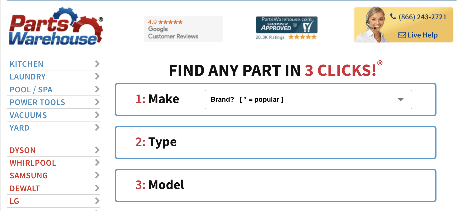
PartsWarehouse.com Old Design
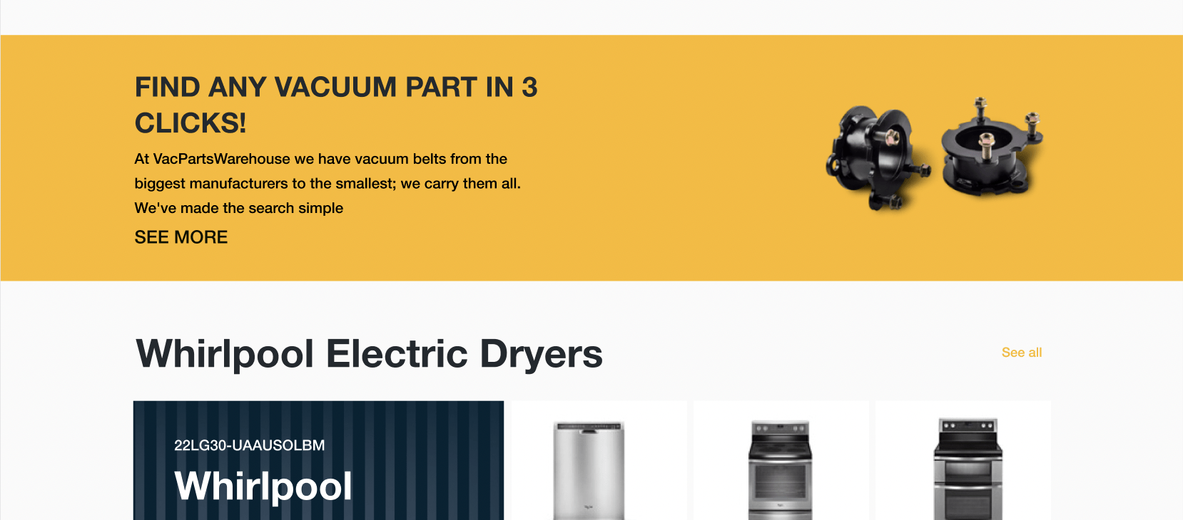
Before Optimum 7 worked with this client, their design was not what you would expect from a modern website. The colors didn’t blend well with the background, and everything felt on the same level of importance.
When visiting a website, users typically see things from left to right and concentrate on the center of the page. This is why logos are typically placed in the upper left corner of a page, with most of the content in the center.
Consider Their Make-Model-Part Finder
The website has a section to find the make, model, and type of warehouse part. The problem with this section is that it is not responsive as only one of three sections has a region where a user can add text.
We replaced this section with Optimum7’s Year Make Model Functionality, which is a more robust, powerful, and stable solution for businesses that need to filter products based on their make, model, etc.
The Mega Menu is Not Visible at the Top of the Page
Although it is not a ranking factor, having your most important information above the fold of your website is a best practice. This helps users understand the purpose of your website.
Their menu was at the bottom of the website, making it difficult for users to find their cart or navigate the website.
Now that we know some of the problems with this website, we can show you all the steps we took to bring this site into the modern age and compete in its niche.
The Importance Of UX & UI Design
A good website is easy to use and constantly changing. It also needs to be easy to update and maintain. This is why we redesigned Parts WareHouse focusing on usability and user experience (UX).
The visual design of a website is referred to as the UI (User Interface). It is what you see and interact with on the page. UX refers to how users interact with your product or service, including their experience within it.
UI Design involves designing all the elements that make up the user interface: menus, buttons, forms, tables, etc., and how they will look once implemented into code. UI designers must understand how users interact with each element so customers have a user-friendly experience.
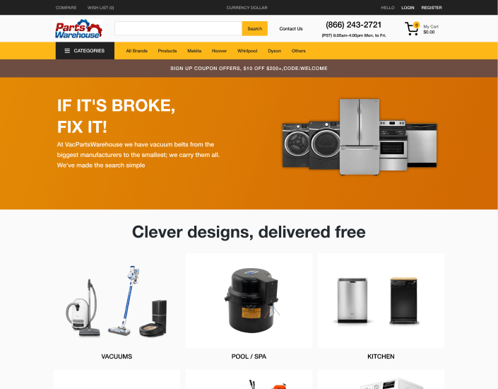
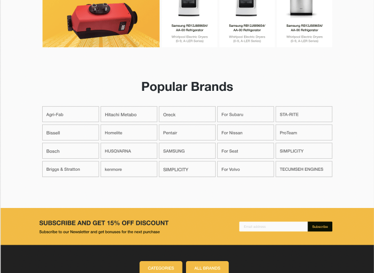
With the new design, we changed the color scheme so that the different parts of the page are more distinguishable. The new interface increases user engagement and makes the contents easier to read by having a focused and straightforward design.
Several divisions were made to separate content for specific parts of the site. The header now has a clean style with the user’s cart, contact information, and hours of operation.
Users are now more informed on what this website is about and what services Parts Warehouse provides.
These changes will help:
- Enhance customer engagement with product pages
- Create a website that stands out from outdated and text-heavy competitors’
- Build trust among customers (reviews, authority, etc.)
Simple Navigation
You want your users to find the information they’re looking for easily. This involves a clear and consistent navigation structure and an easy-to-use user interface.
The most critical feature of navigation is that it is always visible. If you can’t see what’s going on on your website, no one will notice or understand what’s going on.
The navigation elements should be easy to find, use, and understand.
Visually appealing websites frequently use whitespace effectively at the top of their pages, which can be used for precise navigation. If you want to make your branding or marketing messages visible on every page, use this space.
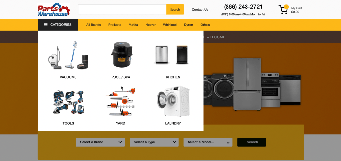
The new mega menu organizes all of the product pages better. Text can be difficult to read when scrolling in a standard drop-down menu. Mega menus make it easier to navigate, reduce clutter, and show shoppers relevant products.
Test Your Website
Testing a website is essential for many reasons. It can help you identify problems early on, so you don’t have to spend as much time and money fixing them later.
Testing is far more than just checking out how your site looks; it requires understanding what makes up a compelling user experience (UX). You need this knowledge to understand how people interact with your website and what components make up those interactions.
As a designer or developer, this will allow you to create something that meets all users’ needs while still providing value!
We tested different designs until we found what works for Warehouse Parts. We added a Sticky Add to-Cart function so that a bar is attached to the top of the page. The bar moves with the customer as they browse your website. Websites with a Sticky Add to-Cart feature receive 8% more orders than those without.
Strong and Visible Call to Action
Your site’s call to action (CTA) is critical. People will click on it, so it must be clear, concise, and noticeable. Many CTAs are acceptable as long as they are clear about their purpose and the next steps.
The CTA should be visible throughout the page or section where it appears so users know what to do next without having to read any additional text first.
Warehouse Parts has a new design as well as a new message. This includes the option to sign up for deals and discounts. A simple message and design reduce confusion and encourage customers to return.
Optimum7 Increases Conversions and Improves Design
When creating a website, you must do more than ensure the design looks good. You also want it to be easy for users to navigate and find information on your site. A cluttered site with too many links can confuse visitors, while an overly complicated navigation system will leave them confused about how best to use your site.
We had a few objectives in mind when designing the new PartsWareHouse website. First, we ensured it had a clean and modern design. We wanted the site to be simple and pleasing to the eye.
We wanted to make sure the site worked well on mobile devices. More and more users are turning to their mobile devices when browsing the web, so ensuring your website functions well on mobile devices is essential. As a final goal, we wanted the site to be conversion-friendly.
Bulletproof Your Website’s Design Today
If you want to redesign your website but find it too large a project to tackle on your own, Optimum7 is here to help. With our years of experience as a development and design agency, we have assisted countless eCommerce businesses in completing projects that were too large for them to complete alone. Contact us, and let’s talk about your business today.


