10 Minute Read

Vitamin Discount Center Case Study

How We Implemented Mega Menu Functionality to Vitamin Discount Center’s Shopify Site

The Business

Vitamin Discount Center is a retailer of vitamins, supplements, health, beauty, and sport nutrition products; it was founded in 1998. Since then, they have contributed to customers’ healthy lives through high-quality nutritional supplements. Vitamin Discount Center every day offers special discounts and fair prices on products for men, women, kids, and pets. They retail more than three hundred brands.

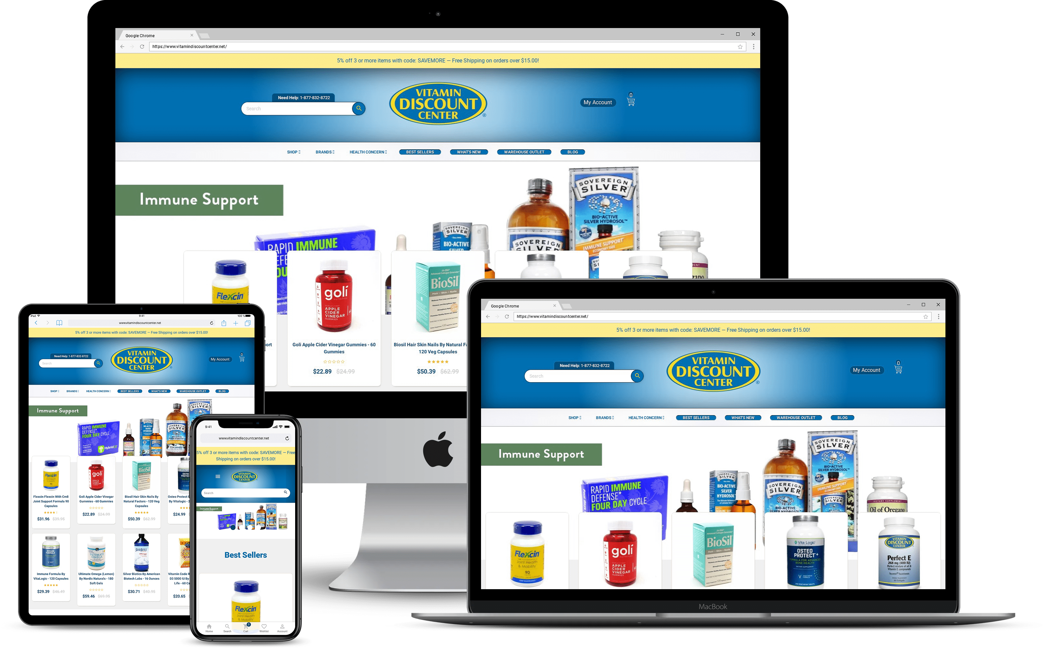
Vitamin Discount Center had a long list of options on their online store. They felt the deficiency of helpful visual clues to collect customers and their data. Due to wanting to improve their website’s usability, Vitamin Discount Center came to us in December 2019.

The Objective

Vitamin Discount Center didn’t need more products or promotions; they needed clarity. Too many visitors were getting lost before they ever reached what they came for. The goal was simple: make it easy again.

Our main objective was to use a mega menu structure on Vitamin Discount Center’s online store. This would make the website easy to use with well-designed navigation. A mega menu is an expandable menu type. It shows the many options in a two-dimensional dropdown layout. We aimed to help their visitors to easily and quickly find the products they desire.

The Strategy

We started by studying how customers moved through the site where they clicked, where they stopped, where they gave up. It became clear that the issue wasn’t the products; it was the path to them.

So we built a new structure around a mega menu, designed to make sense at a glance. The top navigation stayed clean and familiar, while the dropdowns expanded to reveal categories, subcategories, and product types in one clear view. No endless scrolling, no dead ends, just a calm, organized layout that let people move naturally.

Every detail mattered. The fonts, spacing, and flow all worked together to create something that felt light and simple. Within days of launch, the difference was obvious: visitors were staying longer, exploring more, and actually finding what they needed without friction.

Results

When the new menu went live, the difference wasn’t subtle. The site finally felt light again. Visitors stopped rushing to leave. They clicked, explored, and actually enjoyed the experience. What used to feel confusing now felt natural, and that shift could be seen in every part of the data that followed.

89% Increase in Page Dwell Time

People began spending more time on the site. They looked around, compared products, and read through details instead of skimming and leaving. You could sense that something had changed, they were engaged. Page dwell time grew by 89%, showing that the site was holding attention the way it should.

55% Increase in Conversion Rate

Buying started to feel easy again. When people could find what they needed without confusion, they moved through checkout naturally. The new structure turned frustration into flow, and this led to a 55% increase in conversion rate. It wasn’t about flashy design, just a better experience that built quiet trust.

27% Decrease in Bounce Rate

The exits slowed down. Visitors who used to leave almost instantly began staying to see more. The new structure gave them direction without pressure, and that small change made all the difference. Bounce rate dropped by 27%, not because we forced engagement, but because the experience finally made sense; calm, clear, and easy to follow.

Vitamin Discount Center
Share on Social Media
Your AI Visibility Report Awaits