Bringing the Beach to the Inbox
Flojos has been a staple in the casual footwear world since 1972. With its roots in the laid-back surf culture of Guadalajara, Mexico, the brand has built its legacy around comfort, durability, and affordability. Whether you’re slipping on a pair of sandals for a weekend beach trip or lounging around town, Flojos has become synonymous with everyday ease.
But while their sandals deliver on that promise, their email marketing didn’t.
Before we stepped in, Flojos’s emails felt disconnected from their brand personality. Despite having a recognizable product and broad appeal, their email system lacked strategic flow, brand voice, and relevance. It underperformed where it mattered most: nurturing new subscribers, converting abandoned shoppers, and building loyalty among repeat customers.
Our job? Turn that around by creating a holistic, behavior-driven email marketing ecosystem that didn’t just talk to customers, it walked with them, step by step.
What follows is a breakdown of how we restructured and rebuilt Flojos’s entire email marketing system across seven core lifecycle flows and 34 total emails. We anchored each flow in the emotional DNA of the brand: beachy, optimistic, easygoing, yet precise, helpful, and revenue-driven. Let’s walk through what we built.
The Challenge: Basic Emails for a Brand With Soul
Flojos had a lot going for them, a decades-old brand, affordable price points, and a massive SKU range across men, women, and kids. But their email marketing lacked:
- Lifecycle logic: Emails weren’t connected or behaviorally triggered.
- Brand voice: Nothing captured Flojos’s relaxed, fun, tropical vibe.
- Segmentation: Everyone got the same messages, regardless of behavior or product interest.
- Retention: No systematic approach to re-engage or upsell past customers.
The result? Email was contributing far less than it could to total revenue. Worse, it was missing the chance to create memorable moments for customers who clearly loved the brand.
Understanding the Brand: Why Flojos Stands Out
Flojos doesn’t pretend to be a fashion brand. And it doesn’t sell performance gear, either. It lives in the in-between: relaxed, everyday sandals that are equal parts functional and affordable. The average product costs between $15 and $35. That makes it a spontaneous purchase for some, but a staple purchase for others.
That context shaped our strategy. We weren’t building an email system for luxury or urgency. We were building one for ease. For joy. For the feeling of kicking off your shoes and sliding into something comfortable.
And we needed the email flows to reflect that.
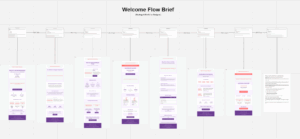
Welcome Flow Optimization: Making a First Impression That Feels Like Summer
Flojos’s customers aren’t just shopping for sandals — they’re shopping for a feeling. The sound of waves in the distance, the warmth of sun on skin, the freedom of walking barefoot (or almost) through a long weekend. That’s the emotion we needed to bottle up in their welcome flow.
The original three-email sequence lacked that vibe entirely. It felt like any other ecommerce brand — forgettable design, plain product grids, and uninspired copy. Our goal was to fix that. We expanded the welcome flow to a thoughtfully sequenced 8-email journey, each step reflecting the brand’s personality: easy, breezy, and designed to move the customer closer to that first pair of Flojos.
1. Meet Flojos — Comfort Since ’72
This first message had a job to do: quickly show what makes Flojos different, and get people to the site while they’re still interested. We opened with a wide-lens image of Flojos on sand, sunlight spilling across the frame. The copy was casual but confident — “Flojos have been keeping toes happy since 1972.”
We gave them a 15% off code (styled inside a sun-kissed banner) and highlighted bestsellers from each major category — Men’s, Women’s, Kids’. This wasn’t a hard sell. It was an invitation to explore.
2. From Mexico’s Beaches to Your Backyard
Flojos has a heritage worth telling. In this second email, we told that story — starting with the brand’s roots in Guadalajara and connecting it to the relaxed, sunshine lifestyle they still stand for. A simple brand timeline led into featured products that haven’t changed much over the years — because they didn’t need to.
This wasn’t just history for the sake of it. It was about showing the legacy of comfort — a reason to trust the product even before touching it.
3. Favorites First — No Guesswork Needed
Choice fatigue is real. We wanted this email to make shopping feel effortless. We curated Flojos’s top-rated products — sorted by gender and age — with real customer quotes beneath each one. “Wore these on vacation every day. Still going strong.” “The softest footbed I’ve ever felt.” These weren’t reviews pulled randomly. They were carefully matched to the product featured.
By the end of this email, a new subscriber should feel not only informed — but confident in what they want.
4. Your Discount’s Ticking Down
We didn’t need to shout. Just a quiet reminder—your 15% welcome discount is almost gone. That was the tone. A subtle countdown bar, no blinking lights or pushy language, just a soft nudge that said, “Hey, don’t miss this.” But urgency wasn’t the point. We knew what really matters: people want to feel safe before they buy. So we laid it all out—how easy it is to send something back if it’s not right, what our comfort guarantee actually means, how to figure out your fit without guessing, and that shipping’s on us once your cart hits the mark. This wasn’t pressure. It was permission. Permission to take a chance, knowing we’ve got their back if anything feels off.
5. How We Stack Up (Without Naming Names)
Let’s be honest—people compare. They open tabs, scan prices, and try to figure out if the extra dollars with another brand are actually buying them anything better. So instead of dancing around it, we helped them out. This email laid out the facts in a clean, side-by-side format: Flojos delivers the same comfort and durability (sometimes better), in more sizes, with an easier return process—all at a friendlier price. No digs, no gimmicks, no competitor shade. Just a smart, clear comparison that made one thing obvious: you don’t need to overspend to get quality.
6. Join the Flojos Fam
Time to lean into social proof. This email highlighted the Flojos community: real photos from Instagram, curated testimonials, and lighthearted “where our Flojos have been” snapshots. (Yes, one pair made it to a music festival in Iceland.)
We also introduced a branded hashtag and encouraged new customers to share their own Flojos moment once they buy. Subtly, it reinforced the idea that this was more than a purchase — it was joining a laid-back tribe.
7. Last Call for 15% Off
The final discount reminder. Simple design. Countdown bar. Big CTA. But the twist? Instead of pushing product again, we focused on use cases — “Styles that work from brunch to boardwalk.” “Built for pool days and road trips.”
This gave the discount emotional context. The sandals weren’t just shoes — they were tools for freedom.
8. A Note from the Flojos Family
Instead of a final promo blast, we closed this sequence with a quiet, personal email from the founder. It thanked them for considering Flojos and asked for honest feedback. It invited dialogue, not transaction.
We gave them a soft exit with one last chance to explore the site — no pressure. Just good vibes.
Why This Flow Works
This welcome flow doesn’t just pitch product. It sets a tone — one that matches the brand’s soul. Each email walks the line between inspiration and action: enough beauty to draw them in, enough clarity to move them forward. By building trust before urgency, Flojos earns its place not just as a summer purchase — but a return destination.
Abandonment Flow Optimization: Bringing Back the “Almost There” Shoppers
For a brand like Flojos—where price points are low and impulse buying is common—abandonment flows have to walk a fine line. You can’t come on too strong, or you risk turning a casual browser into an unsubscribe. But if you wait too long or say too little, the interest fades entirely.
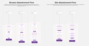
We rebuilt both the Site Abandonment and Browse Abandonment sequences with that in mind. These flows weren’t about urgency alone—they were about gently re-inviting, removing friction, and letting the shopper re-engage on their own terms.
Site Abandonment Flow (2 Emails): A Gentle Nudge Back to the Beach
These emails were triggered when someone landed on the Flojos site but didn’t engage with a specific product. Our goal? Rekindle curiosity and provide a starting point for exploration.
1. “What You Might’ve Missed at Flojos”
We sent this 24 hours after the visit. The tone was breezy, not pushy. We used a sunny lifestyle image—someone slipping on sandals next to a beach bag—to re-capture the relaxed spirit of the brand.
The body highlighted three core categories: Women’s, Men’s, and Kids’. Each was paired with a quick blurb (“Comfort that lasts all summer,” “Flip-flops built for pool days and beyond”) and a button to shop that section.
This email didn’t assume anything. It just re-opened the front door and invited them back inside.
2. “Why Our Customers Keep Coming Back”
48 hours later, if they hadn’t returned, we sent a second message focused on brand value and product credibility.
We used a vertically stacked layout to showcase:
- 50+ years of sandal design heritage
- Real customer review stats (e.g., “20,000+ 5-star reviews”)
- An easy-to-digest infographic on comfort and durability features
By the end of this email, the reader understood why Flojos wasn’t just another sandal brand. No hard sell—just real reasons to care.
Browse Abandonment Flow (3 Emails): Personal, Product-Led Re-Engagement
Triggered by visits to specific product pages, this flow used dynamic content to pick up the conversation exactly where the shopper left off.
1. “Still Thinking About These?”
This was sent just 4 hours after browsing. We wanted to catch them while the item was still fresh in their mind.
At the top: a clean photo of the product they viewed, plus price, rating, and a one-line customer quote.
Below: “You looked at this…” followed by “You might also like…”—three algorithmically selected similar styles.
This was a friendly check-in, not a push. Just a reminder that the beach is still waiting.
2. “The Flojos Difference, Explained”
24 hours later, we focused on what makes these sandals worth it.
The product they browsed was reintroduced with:
- Comfort feature callouts (padded footbed, arch support, etc.)
- Short testimonials that speak to that product specifically
- An optional size and fit guide
- A “Still Deciding?” section that linked to customer Q&A
This email helped reduce doubt and reframed the product as a smart, reliable purchase.
3. “A Little Nudge to Make It Yours”
The third and final email was delivered after 72 hours and offered a time-sensitive 10% discount code.
But we framed it as a thank-you, not a sales ploy: “We appreciate you checking out Flojos. If you’re still thinking about that pair, here’s 10% off to make it easier.”
The CTA button said: “Let’s Make This Official.”
By this point, the shopper had been reassured, informed, and respected. The discount just gave them a little more reason to say yes.
Why This Flow Works
This abandonment flow works because it doesn’t treat walking away as a failure—it treats it like part of a thoughtful shopping journey. Instead of bombarding the customer with pressure, it gently reopens the door with helpful reminders and relevant context. Every touchpoint reflects what the shopper actually browsed, so it never feels random or robotic. And while incentives exist, they’re held back until the end, preserving the brand’s value and only rewarding customers who are truly considering a purchase.
The real strength of this flow is that it doesn’t overplay its hand. It respects the customer’s process, meets them with clarity instead of clutter, and helps them come back on their own terms. That’s not just smart email marketing—it’s good customer service.
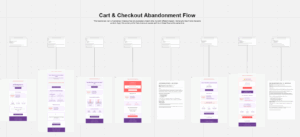
Cart & Checkout Flow Optimization: Closing the Loop With Confidence
When someone adds Flojos to their cart, they’re more than interested—they’re almost there. But even with affordable pricing, hesitation can creep in: Will they fit? Is the material good? Will they actually be comfortable? The goal of our cart recovery system wasn’t to shout “Come back!”—it was to answer those silent questions with clarity, warmth, and persuasion.
We designed an 8-part cart abandonment flow that did more than recover lost orders—it built a bridge of trust and nudged customers from consideration to confident purchase.
1. “We Saved Your Cart for You”
This email simply reminded shoppers that their items were waiting. We used clean, direct copy: “Don’t worry, we’ve saved your Flojos.” Below that, we showed exactly what they left behind—product image, size, color, and price—along with a simple CTA: “Return to Cart.”
To ease hesitation, we added a small block outlining free shipping thresholds and delivery times. Subtle trust cues like “Secure Checkout” and “Easy Returns” icons rounded out the design. The goal here? Stay top of mind without applying pressure.
2. “Why Customers Love What’s in Your Cart”
This follow-up was entirely built around social proof. We embedded reviews, user-generated photos, and quick stats (“5,000+ people chose this style last month”) that spoke to each abandoned product.
It wasn’t about showing popularity for the sake of it—it was about saying, “Others love these too, and here’s why.” We closed with a friendly CTA: “See What You’re Missing.”
3. “Got Questions? Let’s Clear Them Up”
Here, we anticipated objections. We created a simple, clean FAQ block that tackled the top concerns:
- “Will they fit?” → linked to our sizing guide with illustrations
- “Are they comfy?” → highlighted the cushioned footbed and arch support
- “Can I return them?” → explained the hassle-free return process
- “Are they durable?” → pointed to verified reviews and materials used
It wasn’t a hard sell—it was confidence-building. No hype. Just facts.
4. “A Little Extra to Help You Decide”
Now we introduced the first incentive: free shipping, regardless of order value. We framed it as a thank-you, not a tactic—“Just to make your decision a little easier.” The email included a countdown graphic (48 hours left), a soft CTA (“Redeem Free Shipping”), and the saved cart items prominently displayed.
This gave the hesitant buyer a gentle push without feeling transactional.
5. “Picture Yourself in These”
This creative email replaced stats and specs with aspiration. We featured UGC photos and lifestyle shots of the exact products in real-world scenarios—beach, park, backyard barbecue.
Copy was light and sensory: “Slide into comfort. Feel the breeze. Walk from sunrise to bonfire without a second thought.”
It made the cart items feel personal. Wearable. Real.
6. “Still Thinking About It? Here’s 15% Off”
This was the strongest incentive in the flow. We offered 15% off with a clearly presented code and 48-hour expiration window. The tone? Respectful, not pushy.
We acknowledged the delay: “We know decisions take time. But if price is the hold-up, here’s something to help.”
This email was about closing the loop without compromising brand tone or value perception.
7. “Final Reminder—Cart (and Discount) Expiring”
We kept it brief and visual. A large “Last Chance” banner, a real-time countdown, and one CTA: “Return to Cart & Redeem 15% Off.”
This was the final nudge for buyers who’d been on the fence but had shown high intent.
8. “Missed It? We Saved a Few Styles Just for You”
Rather than declaring the door closed, we reframed the exit: “We noticed your cart expired, but good news—we saved your top picks.”
We showed their abandoned items again, alongside similar alternatives (“Loved this? You might also like…”). A final CTA said: “Take Another Look.”
This last touchpoint respected the shopper’s journey. It let them stay in control while leaving the door wide open.
Why This Flow Works
The cart recovery flow succeeds because it understands what hesitation really feels like. It doesn’t rush or guilt the customer—it guides them. From the very first message, it strikes the right balance between friendly and informative, mirroring the relaxed vibe of the Flojos brand.Each email plays a unique role in the journey. The early ones rebuild momentum. The middle ones answer unspoken questions—about fit, returns, shipping, and comfort. And the final messages introduce incentives in a way that feels earned, not desperate. By the time a discount appears, it’s not a bribe—it’s a thank-you for sticking around.
We didn’t build this flow to close a sale at any cost. We built it to be helpful, clear, and quietly persuasive. That’s how you earn trust—and that’s how Flojos turns a forgotten cart into a new favorite pair of sandals.
Building Confidence: Clear Info at the Right Time
Great marketing doesn’t sell, it removes doubt. For Flojos, a brand built on $10–$30 sandals, impulse buys were common, but hesitation still crept in. Not over price, but over questions: Will they fit? Are they comfortable? Can I return them?
So we didn’t create a help center. We built answers straight into the buying journey, inside welcome flows, cart emails, and post-purchase touchpoints. No friction. Just clarity when it mattered.
Sizing Shouldn’t Be a Gamble
Shoe fit shouldn’t be a guess. We placed a visual size guide right below product listings and in key flows — welcome, cart, post-purchase. Conversational tone. Straightforward logic: “If you’re between sizes, go up. Comfort first.”
Comfort Explained Like a Human Would
No one buys sandals because of midsole density. So we skipped the specs and wrote like people talk: “Padded in all the right places.” “Built for barefoot days, from sand to sidewalk.” We paired this with real customer quotes and easy visuals that showed, not told.
Make Returns Feel Less Like a Risk
We didn’t treat returns like legal fine print. We used them as reassurance: “Wrong size? No worries.” “30 days to change your mind.” A 3-step visual — print, pack, send — made it effortless. A clear link to the portal sealed the deal.
Answering the Shipping Question Before They Even Ask
Shipping doesn’t sell, but bad shipping kills deals. We made timelines, costs, and free shipping thresholds visible across emails and carts. If they were $5 away from free shipping, we told them. If it shipped with USPS or UPS, we showed the logo. Simple confidence boosters.
Showing, Not Shouting, Why Flojos Deserves a Spot in Their Closet
Instead of shouting why Flojos was better, we quietly reminded them. A subtle “Why Flojos” block in welcome and winback flows compared our comfort, price, and style to the market. No digs. Just reasons to believe — and come back.
Why We Used This Strategy ?
It wasn’t a one-time email. It was a through-line. Clear, relevant info that showed up exactly when needed. No jargon. No noise. Just quiet answers that turned hesitation into confidence — and buyers into believers.
Post-Purchase Flow Optimization: Turning One Purchase Into a Summer-Long Relationship
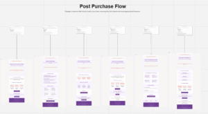
The post-purchase moment is one of the most overlooked yet powerful stages in the customer lifecycle. For Flojos, it was more than just sending a receipt and hoping for a review. We wanted to turn a single order into something more enduring — a seasonal favorite, a returning customer, a lifelong fan. This flow wasn’t about transaction. It was about trust, timing, and staying helpful long after the sale was done.
Every message in this six-part sequence was crafted to make the customer feel supported, welcomed, and understood — without ever sounding like a form letter.
1. Your Flojos Are on the Way
The first message in this sequence was the order confirmation, but we gave it more warmth than the typical transactional email. Beyond the order details, we added a short note thanking the customer for joining the Flojos community — language that felt more like a welcome than a receipt. We highlighted what to expect next, when it would ship, and how to track their package. The tone was casual but clear: “We’re getting your sandals ready — here’s everything you need in the meantime.”
2. While You Wait, Here’s What to Know
The second message went out before delivery, but it wasn’t filler. It was packed with helpful content — care tips, wear-in advice, and a short video on how to get the most out of their new sandals. The vibe was easygoing and supportive, almost like a friend texting you to say, “Hey, these break in great after day two — just a heads up.” We also included a quick preview of complementary products they might like, but without the pressure of a hard upsell.
3. Everything Land OK?
A day after expected delivery, we sent a short, friendly check-in. The message opened with a genuine question: “Did your Flojos arrive safe and sound?” Then, depending on their answer, the customer was directed to either a quick satisfaction survey or our support team. The tone was proactive but never intrusive. It was less about gathering reviews, and more about showing up when most brands go quiet.
4. Tell Us What You Think
This was our review request email — but we made it feel like a conversation. We reminded them of the exact pair they purchased, added a photo, and asked, “How are they treating your feet so far?” Instead of focusing on what we wanted (a review), we leaned into what they might want: to share a good find, to help someone else make a decision, to feel heard. We also included a small thank-you offer — 10% off their next pair — as a reward for taking the time to leave feedback.
5. Your Flojos, Styled Your Way
Roughly two weeks after delivery, we nudged customers with a little inspiration — how to wear, style, and care for their sandals depending on the occasion. Whether they were heading to a backyard BBQ, a pool party, or just running errands, we showed them that Flojos were versatile enough for it all. The message was image-heavy, relaxed in tone, and packed with subtle cues that said: “You didn’t just buy a product. You bought comfort that fits into your life.”
6. A Little Something, Just Because
We ended the flow with a note of gratitude. This wasn’t about another push to buy — it was about closing the loop with care. The message was simple: “Thanks for choosing us. Here’s a small token to say we appreciate you.” We included early access to an upcoming product drop and an invite to join our Instagram community, where customers could see how others were styling their pairs. The email felt like a closing gesture — warm, genuine, and appreciative — that also set the stage for future engagement.
Why This Flow Works
This post-purchase sequence isn’t just about delivering information. It’s about delivering reassurance, recognition, and resonance. From the moment the order is placed to weeks after it arrives, every message deepens the relationship without ever asking for too much. It’s soft-touch, high-impact communication that builds loyalty by showing up with value, not volume. We didn’t just confirm a sale — we confirmed their choice, and that makes all the difference.
Customer Retention: Turning Buyers into Beach-Loving Regulars
Retention isn’t about the hard sell. It’s about staying relevant after the purchase—delivering value, reinforcing satisfaction, and giving customers a reason to come back before they forget why they loved you in the first place. For Flojos, the goal wasn’t just to drive more purchases. It was to keep the brand top of mind every time the sun came out and sandals came off the shelf.
We rebuilt three essential flows—Winback, Post-Purchase, and Sunset—with an approach tailored to Flojos’s casual, seasonal, multi-generational customer base. The tone? Warm, friendly, easy-going. The goal? More repeat buyers, fewer lapses in engagement, and longer customer lifetime value.
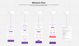
Winback Flow Optimization: Reigniting the Love (5 Emails)
The Winback flow was triggered for customers who hadn’t purchased in 120+ days. These shoppers weren’t necessarily gone—they just needed a reason to return. Instead of flooding them with discounts, we layered in warmth, newness, and relevancy.
1. A Friendly Nudge with a Reason to Revisit
A soft reintroduction, framed like an old friend saying hello. We reminded them of what they loved—comfort, style, simplicity—and offered a generous 20% discount to bring them back. The email featured new arrivals, customer-favorite styles, and a few updated classics they may not have seen yet.
The tone was low-pressure: “It’s been a while since your last visit—come see what’s new. We think you’ll like what you find.”
2. What’s New Since You Left?
Here, we showed them what had changed: new drops, seasonal collections, style evolutions. We used lifestyle imagery to show Flojos in real-life summer settings—on docks, sidewalks, and sandy porches. The message? You haven’t been forgotten. And you haven’t missed a beat.
We wrapped it with quick highlights: “Lighter soles. Brighter colors. Same all-day comfort.”
3. Social Proof from the Flojos Community
This email used real testimonials, Instagram photos, and quote cards from loyal Flojos wearers. We highlighted reviews from customers with long histories (“10 pairs and counting!”), and emphasized the consistent experience: reliable sizing, durable build, feel-good fit.
This wasn’t just a reminder—it was a confidence boost.
4. Personalized Picks to Match Their Past Purchase
Using order data, we matched customers with new styles that echoed the look, color, or features of what they previously bought. Example: If they loved a neutral-tone flip-flop, we suggested similar designs in updated colorways or with improved soles.
The copy was built around familiarity: “You loved these last time—here’s what we think you’ll love next.”
5. Final Tap with a Big Thank-You
This final attempt offered a 25% discount, valid for 5 days. But more than the deal, it was framed as appreciation: “Whether you’ve bought one pair or ten, thanks for being part of the Flojos story.”
It included two CTAs: one to shop, one to follow Flojos on Instagram (for those not ready to buy again yet).
Why This Flow Works
We didn’t chase the sale—we rebuilt the relationship.
It worked because it tapped into nostalgia, community, and timing—not just discounts. The offers were present but not pushy. The voice was honest and laid back. And the content reminded customers why they bought Flojos in the first place: not because they had to, but because they wanted to feel comfortable and connected to summer.
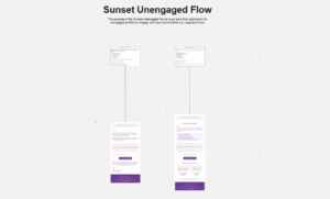
Sunset Flow Optimization: Graceful Goodbyes and Gentle Reentries
Not every customer relationship lasts forever. And that’s okay. The goal isn’t to hold on at all costs — it’s to leave the door open with grace, warmth, and just enough light to guide someone back, if the time ever feels right. That was our approach when designing Flojos’ Sunset Flow.
After 180 days of silence — no opens, no clicks — we knew it was time to check in. Not to win back at any cost. Not to push one more offer. But to make one last, human invitation. And then, if it wasn’t accepted, to say goodbye like a brand that still respects its audience. Because the beach is always there, even when no one’s watching.
1. Checking In With a Warm Nudge
We didn’t show up with a megaphone. We showed up with a sunset. The email opened with soft, sun-washed visuals — mellow tones that felt more like a beach postcard than a promotion.
The headline led with honesty: “We’ve noticed you haven’t been around lately… and that’s okay.” There was no guilt. No “we miss you.” Just an open question: Would you like to keep hearing from us?
Right beneath that, two big buttons gave the reader control: “Yes, I want to stay” or “No thanks, unsubscribe me.” Simple. No tricks. And for those who opted in, a gentle thank-you — in the form of a one-time 15% off code — was included, tucked quietly at the bottom. Not as bait. Just as a gesture.
This wasn’t a reactivation push. It was an invitation to stay connected, if they chose to. And if not? No pressure. No judgment.
2. Letting Go With Class
A week later, if we still hadn’t heard from them, we sent one final note. Not with a warning. Not with a plea. But with a tone that felt like Flojos itself — calm, respectful, and just a little wistful.
The message was clear: “You won’t hear from us again—but if you ever want to come back, the sandals are still comfy, and the welcome mat’s always out.”
No scarcity plays. No last-minute discounts. Just closure — with a soft, smiling door left open.
We included a “Rejoin Anytime” button that linked to the resubscribe page. And in the footer, a few signature Flojos styles served as a visual reminder of what brought them here in the first place. It was a light wave goodbye, not a door slamming shut.
Why This Flow Works
Most brands don’t know how to end an email relationship. They either go silent, or they get desperate. But Flojos did something better — it stayed human. This flow gives power back to the subscriber. It offers them clarity, autonomy, and a frictionless path forward — whether that’s with Flojos, or not.
It respects the customer’s time and attention. It keeps the tone aligned with the brand’s identity: relaxed, thoughtful, unforced. And by ending on a high note, it actually increases the likelihood that those subscribers will return later — not because they were pressured, but because they were treated like people.
This wasn’t about squeezing one more conversion out of a quiet list. It was about ending well. And that, in itself, is rare — and deeply memorable.
Strategy and Implementation: Building Flojos’ Email Ecosystem from the Ground Up
This wasn’t just about better emails. It was about building a living system—one that could flex, grow, and feel like Flojos at every turn. Laid-back, warm, and clear. Not flashy. Just right.
We Started by Listening
Before writing a single subject line, we paused to take in the full picture. The old setup had good intentions but no real rhythm. The welcome emails didn’t welcome. Cart nudges felt forgettable. And once someone bought? Silence.
So we zoomed out. We looked at every touchpoint, every drop-off. We mapped the full journey—from that first hello to the final unsubscribe—and asked: where does this actually feel human? Where does it fall flat?
And we didn’t guess. We pulled benchmarks from similar lifestyle brands to see what “great” actually looked like. That gave us a real target—not just a hunch.
Designing a Journey That Actually Feels Like One
With the gaps clear, we started building. Not just emails, but a real lifecycle—seven core flows: Welcome, Browse Abandonment, Cart Recovery, Post-Purchase, Winback, Sunset, and a unique Clarifying flow designed to answer unspoken questions.
But structure wasn’t enough. It had to feel fluid. If someone browsed men’s sandals, they shouldn’t get an email about kids’ flip-flops. If they made a purchase mid-welcome, the system should adapt. Every flow needed to talk to the others—like a story adjusting to the reader.
Giving the Brand Its Voice Back
Flojos isn’t a specs-driven brand. People don’t buy sandals for foam density—they buy them for backyard hangs, pool days, and chasing kids in the driveway. So that’s how we wrote.
Every email had a clear job to do, but none of it felt like marketing. The welcome flow was breezy and warm. Cart emails felt helpful, not pushy. Post-purchase celebrated the moment—like “Hey, you’re in now.”
We wrote 34 emails that sounded like real people, not copywriters trying too hard. The CTAs felt like natural next steps, not instructions.
A Design That Feels Like a Beach Day
Visually, we needed emails that looked like Flojos felt. So we leaned into coastal colors—soft blues, sandy tones, sun-faded coral. Clean fonts, natural photos, buttons that invited clicks without shouting.
We built it all in a modular design system inside Klaviyo. That meant the Flojos team could swap in new products, change messaging for the season, or run A/B tests without blowing up the whole flow.
Behind the Scenes: Every Detail, Dialed
Then came the part no one sees—but everyone feels. We coded every email in Klaviyo. Every trigger, every delay, every block of dynamic content that swapped in the right product or message based on behavior.
We didn’t just check links. We tested load times, mobile views, fallback logic. We made sure the right emoji showed up in Gmail and didn’t tank deliverability. We tapped every button and read every line on a phone screen before launch.
We rolled out in phases, watching metrics live and making quiet tweaks as we went.
Teaching the System to Run Without Us
Once it was live, we didn’t hand over a folder and disappear.
We gave the Flojos team everything they’d need to keep the system healthy. We set KPIs for every flow—opens, clicks, revenue per email. We created reporting templates they’d actually use. We built SOPs so they could update sizing info, drop in new products, or tweak seasonals without second-guessing.
This wasn’t a one-off project. It was a foundation—something they could build on confidently, without losing the tone or the soul of the brand.
Because a great email system isn’t just well-written or well-built. It’s one that keeps working even when no one’s looking. One that feels, at every turn, like someone thought it through—and built it to last.
Expected Results: Setting the Bar Higher—and Hitting It
While the system was still fresh at launch, we didn’t have to guess at the upside. We’ve implemented similar lifecycle rebuilds for DTC brands with Flojos’ profile—and based on those benchmarks, we anticipated strong gains across the board:
- Open rates expected to climb from a baseline of 15–20% up to 25–30%, fueled by stronger subject lines, consistent send identity, and better segmentation.
- Click-through rates projected to double, jumping from 2–3% to 5–7%, driven by more relevant content and crystal-clear CTAs.
- Conversion rates from email traffic expected to lift 20–30%, particularly in flows where shopping hesitations were addressed head-on.
- Revenue per email projected to increase by 25–35%, especially in Welcome and Cart sequences optimized for average order value.
- List growth expected to rise by 15%, thanks to smarter signup timing, optimized lead capture forms, and incentives that match intent.
- Unsubscribe rates predicted to drop 15–20%, simply by serving better content, more respectfully.
But the real value went deeper than the numbers.
A Sandal Brand With Strategy Beneath the Surface
What started as a set of underperforming flows became something much more—a system of communication that feels just as considered as the footwear it represents.
With 34 emails across seven strategically designed flows, we didn’t just bring structure to Flojos’ marketing. We brought rhythm. Each message now arrives with purpose, tone, and timing that reflects not just what the customer needs—but what they expect from a brand that’s been delivering laid-back comfort since the ’70s.
For brands in crowded consumer categories, this kind of structure isn’t optional—it’s a competitive edge. When every touchpoint aligns, when every flow builds on the last, email becomes more than a channel. It becomes a relationship builder.
Flojos now has a lifecycle engine that educates, reassures, and re-engages without ever feeling like “just another promo.” It’s strategic. It’s respectful. And it’s built to scale.
The sandals are comfy. The system? Even more so. Contact us today to implement the email flows in your business.


