A website is not just a business tool; it’s the virtual storefront, the brand ambassador, and often, the first point of contact with potential customers. GriotsGarage.com, a leader in the realm of automotive care products, embarked on a transformative journey, reinventing its online presence from the ground up. This was not just a redesign; it was a strategic overhaul aimed at enhancing user experience, reinforcing brand identity, and adapting to the ever-evolving digital marketplace.
This article delves deep into the various facets of the GriotsGarage.com redesign. We explore how each change contributes to a more engaging, accessible, and efficient online experience for customers. Our aim is not to sell you a service but to showcase a case study in digital excellence, illustrating how timely and thoughtful redesigns can be pivotal for any business navigating the online world.
Setting the Stage – The Homepage Revolution at GriotsGarage.com
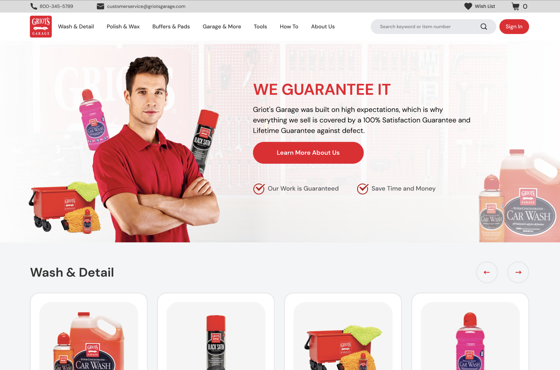
The homepage of GriotsGarage.com now greets visitors with a dynamic, visually arresting header banner. This is more than just an image; it’s the first chapter of the brand’s story. In the digital era, a header banner functions as a billboard, setting the tone for what customers can expect. For GriotsGarage, it’s about striking a balance between showcasing their ethos – “Car Care for the Perfectionist!” – and inviting users to explore their extensive product range.
GriotsGarage.com’s new user interface (UI) is designed to elevate customer engagement and build trust. Gone are the days of text-heavy, cumbersome websites. In their place, a sleek, intuitive UI awaits, setting GriotsGarage apart from competitors. This shift to a more engaging interface not only retains customers but also fosters brand loyalty, proving that in the digital age, good design equals good business.
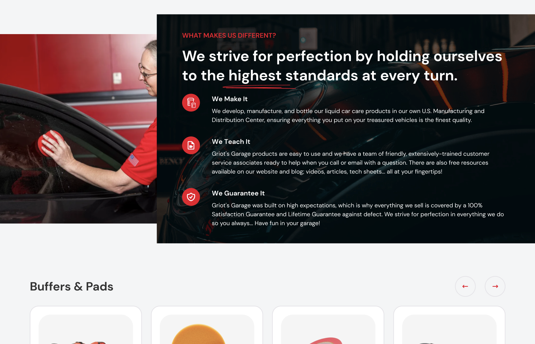
The redesign emphasizes simplicity and clarity. Each element, from the color scheme to the typography, is chosen to ensure a seamless, user-friendly experience. By avoiding unnecessary complexities and jargon, the website speaks directly to the needs and interests of its audience, whether they’re seasoned car enthusiasts or newcomers to automotive care.
A pivotal aspect of the redesign is ensuring accessibility for all users. GriotsGarage.com is now a space where every customer, regardless of their technical savviness or physical ability, can navigate with ease. This inclusivity is not just a moral imperative but also a business-savvy move, broadening the brand’s reach and resonating with a wider audience.
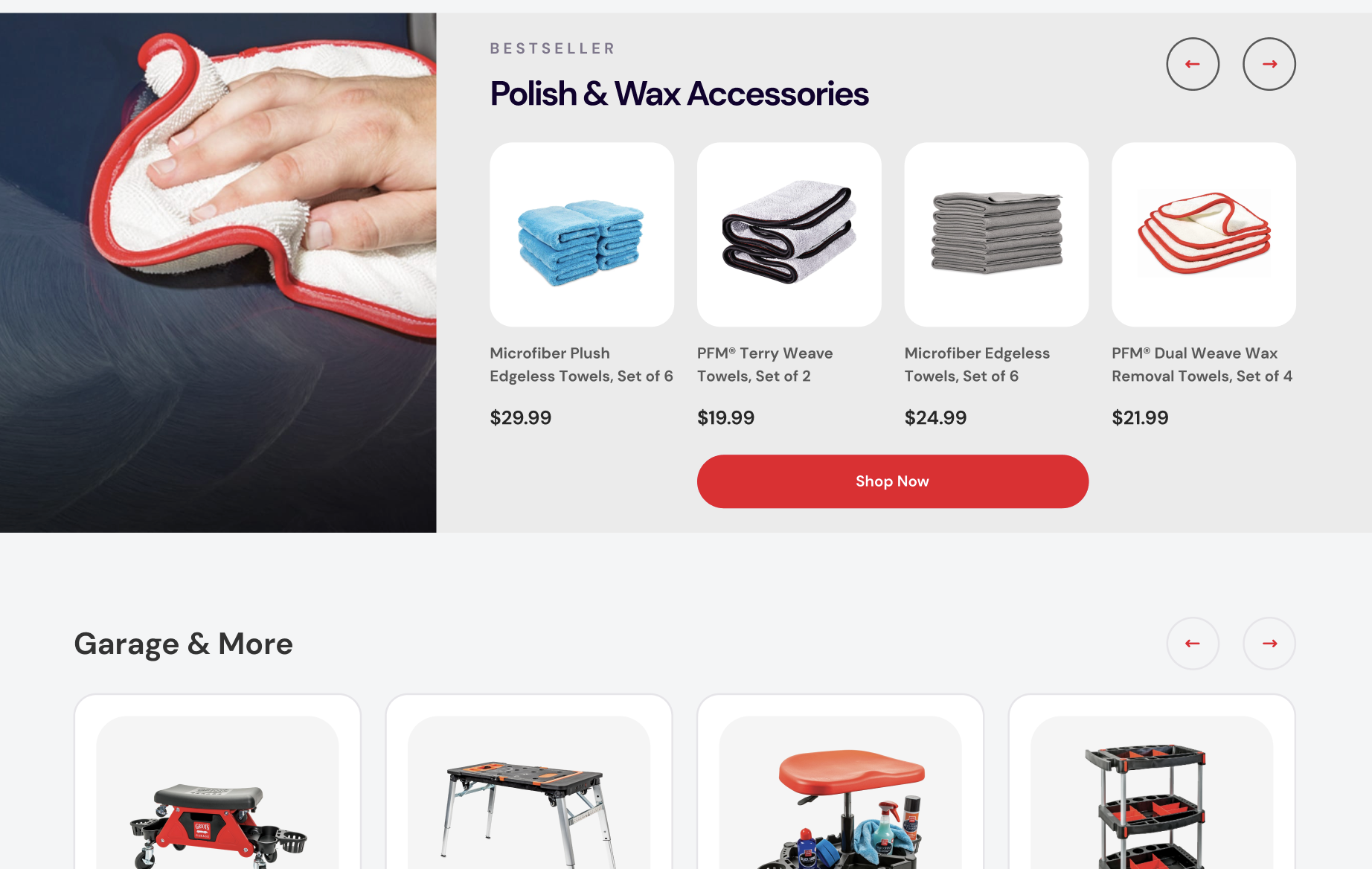
In this chapter, we have unfolded the foundational changes made to GriotsGarage.com’s homepage. These changes are more than just aesthetic enhancements; they are strategic steps towards crafting a digital experience that captivates, engages, and converts visitors into loyal customers. Stay tuned as we delve deeper into the specifics of the redesign in the following chapters, highlighting the innovation and thoughtful planning that went into reinventing GriotsGarage.com.
Elevating Engagement – The Magic of Quick View and Hover Effects
Hover effects, often overlooked, are like the subtle yet impactful nuances in a conversation that make the interaction memorable. In GriotsGarage.com’s redesign, these hover effects have been crafted to not only capture attention but also enhance the user’s journey through the website. When a visitor navigates across different elements – be it product images or call-to-action buttons – these elements respond. This responsiveness is more than a visual treat; it’s a signal of a website that’s not just alive but intuitive and reactive to the user’s needs.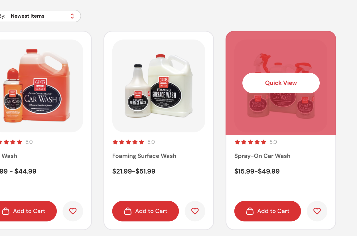
Imagine a visitor exploring car waxes; as they hover over a product, it subtly changes – maybe it grows, brightens, or animates. This immediate feedback loop doesn’t just guide the user; it engages them, making the browsing experience enjoyable and interactive. It’s these micro-interactions that transform a routine visit to an online store into an engaging exploration, enhancing the user’s connection with the brand.
Quick View: Streamlining Selection
The Quick View feature is a game-changer in online shopping. It addresses a fundamental user need – speed. With this feature, customers no longer need to navigate away from their current page to view product details. A simple hover brings up a window offering a snapshot of the product, allowing users to quickly decide without interrupting their browsing flow.
For a site like GriotsGarage.com, where the variety and depth of products are vast, Quick View simplifies the decision-making process. Customers can effortlessly browse through different polishes, waxes, and cleaners, getting key information in a quick, unobtrusive manner. This not only saves time but also enhances the overall user experience, making shopping less of a task and more of a pleasure.
Charting the Course – Mastering Navigation with Mega Menus
In the world of e-commerce, navigation is akin to steering through uncharted waters – it needs to be clear, intuitive, and comprehensive. GriotsGarage.com’s adoption of mega menus is a testament to understanding this critical aspect of user experience. Traditional dropdown menus, often cramped and limiting, have been replaced with well-structured, spacious mega menus.
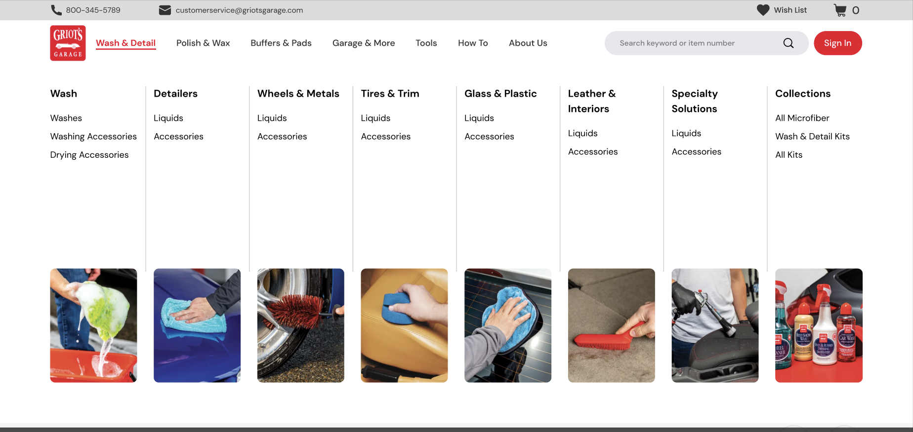
Mega menus are more than just lists; they are the organized display of a website’s offerings, providing a bird’s-eye view of all available products and categories at a glance. For a user, this means no more navigating through a maze of options. Instead, they find a clear, concise roadmap, whether they’re searching for a specific type of car cleaner or browsing through the latest arrivals in detailing supplies.
Clarity Meets Convenience
One of the standout advantages of mega menus is their ability to reduce clutter while promoting key products. GriotsGarage.com’s mega menu not only categorizes products efficiently but also highlights new arrivals, deals, and popular items, guiding shoppers towards desired sections. This strategic arrangement of products ensures that users spend less time searching and more time discovering products that cater to their specific automotive care needs.
In conclusion, Chapters 2 and 3 showcase how GriotsGarage.com’s redesign has put a spotlight on enhancing user interaction and simplifying navigation. By integrating modern web functionalities like hover effects and mega menus, the website not only meets the current standards of e-commerce but sets a new benchmark for user experience. These improvements are a clear indicator that in the digital realm, evolving and adapting to user expectations is not just beneficial but essential for staying relevant and competitive.
Refining the Search Experience – Transforming Category Pages
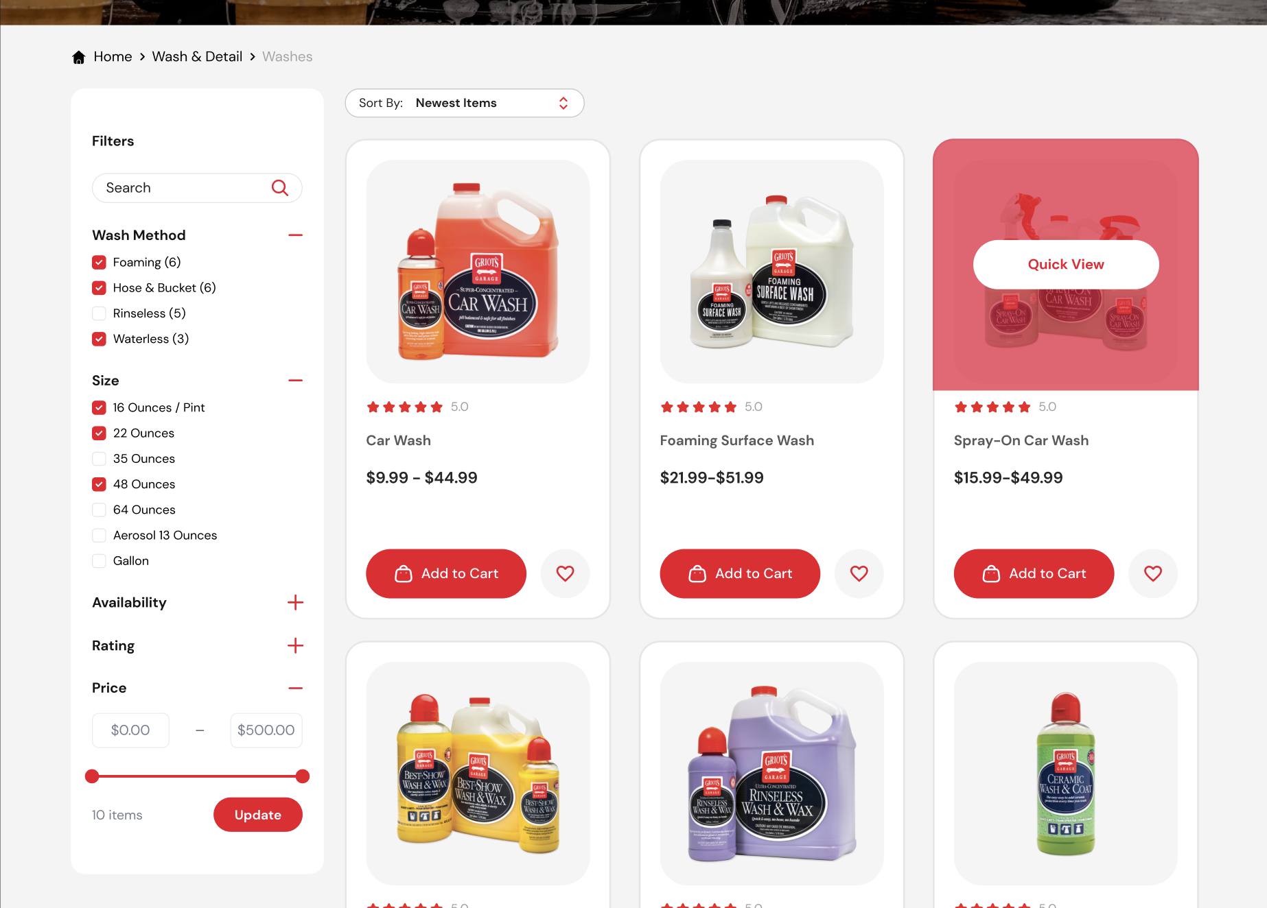
In the digital journey of GriotsGarage.com, the redesign of category pages stands as a significant milestone. Category pages, often the unsung heroes of e-commerce, are where the real exploration begins for many users. Recognizing their pivotal role, these pages on GriotsGarage.com were meticulously optimized to heighten user engagement and simplify product discovery.
Interactive and Intuitive Search Interfaces
The new design introduces an interactive search interface, a gateway to the vast array of products. This feature is more than a mere search bar; it’s an intelligent tool that anticipates and responds to customer queries. With 43% of website visitors using the search function immediately upon entry, according to Forrester Research, this enhancement is not just convenient—it’s crucial. The interface is designed to be user-friendly and aesthetically pleasing, ensuring that customers find what they need with minimal effort and maximum satisfaction.
Powering Up with Effective Filters
Another key aspect of the redesign is the advanced filtering system. Given the extensive range of car care products, filters are indispensable in helping customers navigate the choices. The new filters are not just about narrowing down options; they’re about presenting a variety of products in a way that improves the user experience. This system has been shown to not only reach a wider audience but also significantly increase sales, as even the simple act of adding filters can raise a website’s conversion rate by 26%.
The Art of Display – Perfecting Product Pages
Moving deeper into the customer’s journey, we arrive at the product pages – the heart of the shopping experience. At GriotsGarage.com, these pages were reimagined to build trust and boost sales, turning each page into a showcase of the product’s story, quality, and value.
Authenticity and Trust through Verified Ratings
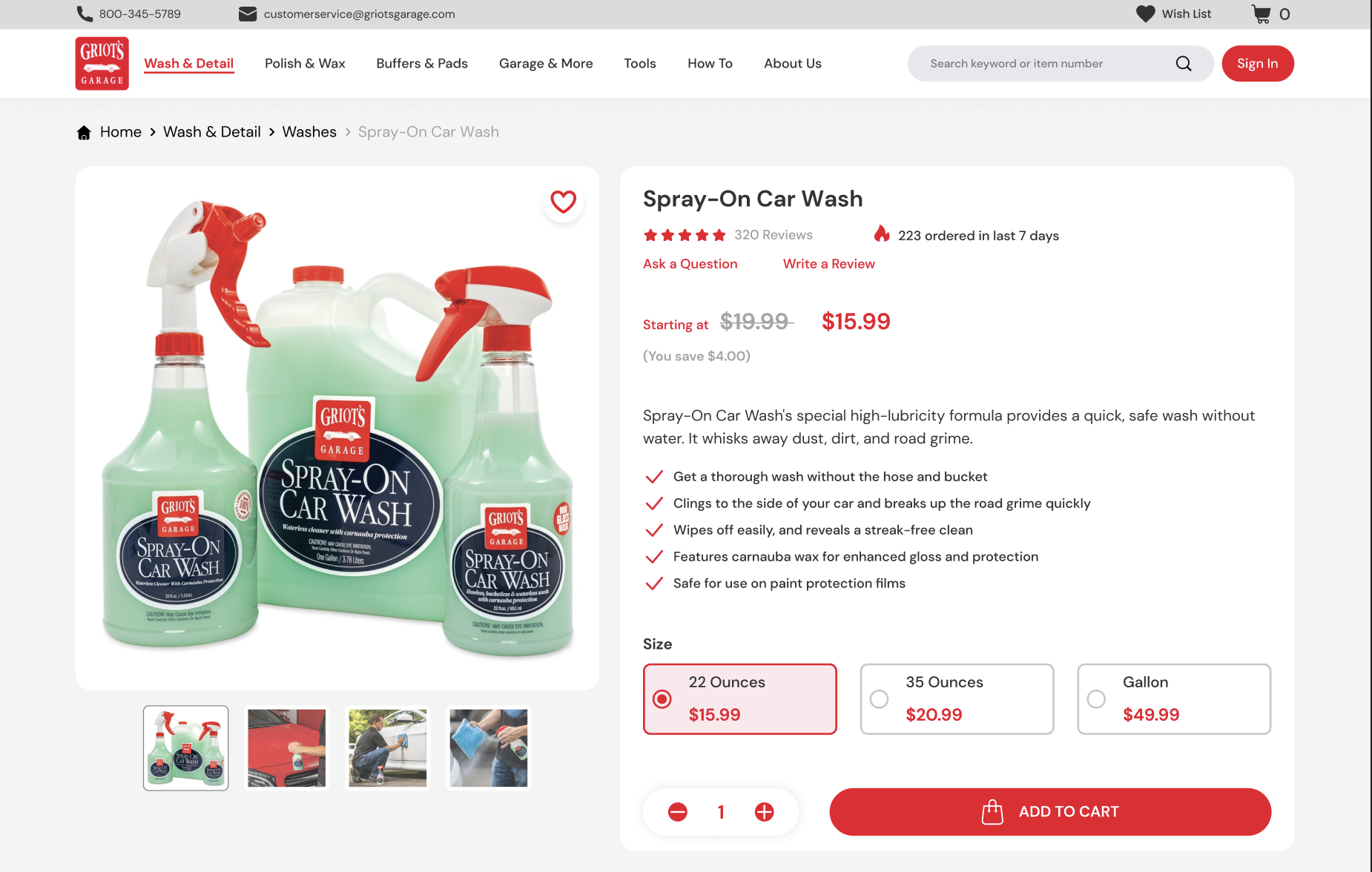
In an era where authenticity is king, verified product ratings are prominently displayed, offering customers honest feedback and building trust. These ratings serve as a seal of quality, reassuring visitors that they are making a well-informed decision. By providing genuine, verifiable customer feedback, GriotsGarage.com solidifies its commitment to quality and transparency.
Balancing Information with Simplicity
Understanding the importance of information presentation, the product pages strike a perfect balance. They provide detailed highlights and features without overwhelming the customer. This balance is crucial in ensuring that the customers are informed enough to make a purchase decision but not so inundated with information that it becomes a deterrent.
Upselling and Cross-Selling: A Strategic Approach
Furthermore, the redesigned product pages smartly incorporate up-selling and cross-selling techniques. Rather than being overt sales pitches, these are subtle, helpful suggestions that guide customers to complementary products or higher-end alternatives. This approach mirrors the experience of a knowledgeable salesperson, enhancing the customer’s shopping experience by offering valuable and relevant recommendations.
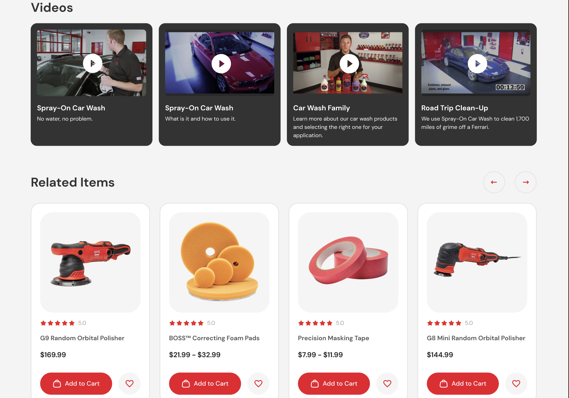
The last 2 parts of GriotsGarage.com’s digital transformation story highlight how pivotal well-designed category and product pages are to an e-commerce site. They demonstrate a deep understanding of customer behavior and preferences, showcasing how an intuitive, customer-centric design approach can lead to increased engagement and higher conversion rates. This transformation serves as a powerful example to all online businesses: adapting to the evolving digital landscape is not just about staying relevant; it’s about providing an unmatched customer experience that drives growth and loyalty.
Seamless Shopping with the “Sticky Add to Cart” Feature
The evolution of GriotsGarage.com’s user experience reaches a new peak with the implementation of the “Sticky Add to Cart” feature. This innovative tool is more than just a technical add-on; it’s a strategic enhancement aimed at smoothing the path to purchase, a crucial aspect of the customer journey.

Convenience at Every Scroll
The Sticky Add to Cart functionality brings a level of ease and accessibility to shopping that was previously unattainable. As users navigate through the detailed descriptions and specifications of products, the option to add items to their cart remains consistently visible, no matter how far down the page they scroll. This persistent presence of the Add to Cart button acts as a gentle, yet constant reminder of the potential purchase, effectively encouraging users to make the decision without the need to scroll all the way back up. It’s akin to having a helpful assistant by your side, ready to take your order at any moment.
Impact on Conversion Rates
The introduction of this feature is not just a matter of convenience; it’s a data-driven decision backed by positive results. Websites implementing a sticky Add to Cart button have observed a significant increase in conversion rates. For GriotsGarage.com, this translates to more successful transactions and a smoother, more satisfying shopping experience for customers. It’s these subtle, user-focused enhancements that can make a substantial difference in the e-commerce landscape.
Conclusion: Driving Forward with Digital Excellence
As we cross the finish line of GriotsGarage.com’s digital transformation journey, it’s evident that this redesign is more than just a facelift. It’s a strategic realignment, a reimagining of what a user-centric, intuitive, and engaging online experience should be. From the captivating first impressions of the homepage to the nuanced convenience of the Sticky Add to Cart feature, every aspect of the redesign focuses on enhancing the customer experience and strengthening the brand’s online presence.
A Beacon for the Future of E-commerce
GriotsGarage.com’s transformation stands as a beacon for businesses navigating the digital waters, demonstrating that the evolution of a website is as much about understanding customer needs as it is about leveraging the latest technologies. It’s a clear message that in an era where digital is the norm, being good enough is no longer enough. The commitment to continuous improvement and adaptation is what sets a brand apart in the crowded online marketplace.
An Invitation to Transform Your Digital Presence
For businesses looking at their own websites and considering the next step, GriotsGarage.com serves as both inspiration and a call to action. The digital world is ever-changing, and staying ahead means being willing to evolve, to embrace new ideas, and to put the user experience at the heart of every decision.
If your website is ready for its next chapter, if you’re looking to infuse new life into your digital presence, we invite you to contact us. Let’s discuss how we can transform your site into a dynamic, user-focused experience that not only meets but exceeds the expectations of your customers. Join us in driving forward with digital excellence.


