In the digital era, where the storefronts of yesteryear are now vibrant web pages, the importance of a compelling online presence cannot be overstated. Forestry Suppliers Inc., a stalwart in the provision of top-tier forestry gear since 1949, understood the necessity of evolving with the times. The recent comprehensive redesign of their website, forestry-suppliers.com, serves as a beacon for all venerable institutions seeking to renew their digital strategy. This transformation was not just a facelift; it was a strategic overhaul designed to navigate the complexities of modern e-commerce, engage a new generation of customers, and enhance the online shopping experience while preserving the rich heritage of the brand.
As we dissect this journey, it is paramount to appreciate that this exercise extends beyond mere aesthetic enhancement. It is about creating a digital environment where ease of use, customer trust, and brand identity are harmoniously balanced to foster engagement and conversion. The ensuing insights delve into the thoughtful application of contemporary design principles that culminate in a user-centric, accessible, and commercially potent online presence.
The Power of First Impressions: Homepage Redesign
The homepage of any website holds an untold power, much like the first few minutes of a meeting or the opening lines of a book. It is the digital handshake, the welcoming committee, and the first opportunity to tell a brand’s story. For Forestry Suppliers Inc., the redesign of the homepage was an exercise in distilling the essence of a brand with decades of history into a single, immediate visual presentation.
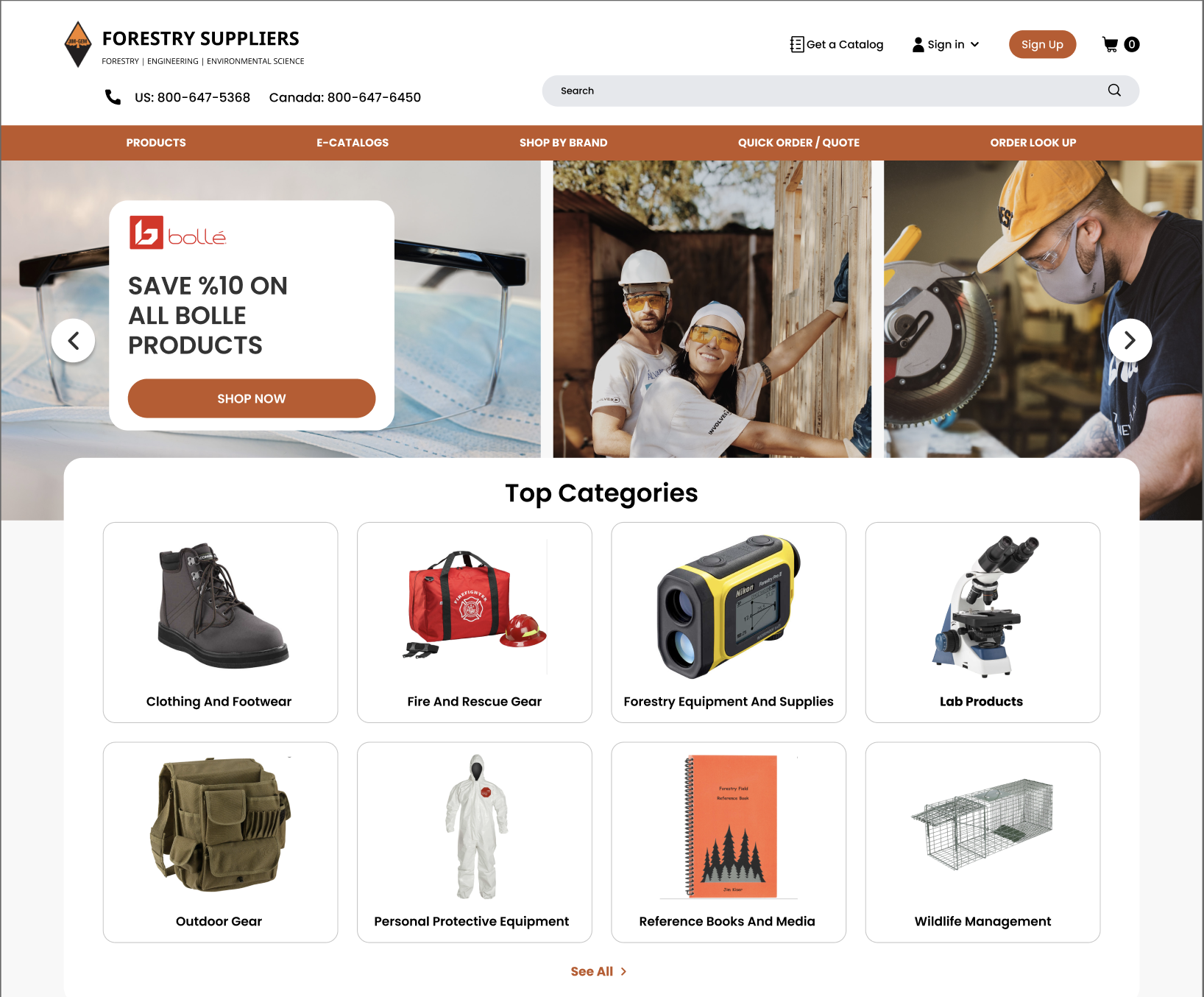
At the core of this initiative was the header banner—a digital marquee that now articulates Forestry Suppliers’ commitment to quality and service. More than a static image, it serves as a dynamic billboard, informing, enticing, and engaging visitors with an immediate understanding of what the brand stands for. Its strategic placement and design are no accidents. They are a deliberate ploy to capitalize on those crucial first seconds of user engagement, setting the tone for the customer journey.
With the new user interface, gone are the days of dense, text-heavy layouts that test the patience of even the most loyal customers. Instead, visitors are now greeted by a clean, contemporary design that emphasizes customer interaction through intuitive navigation and streamlined content delivery. This redesign is not just about looking “modern”; it is about respecting the customer’s time and intelligence, offering a platform where they can easily find what they seek, supported by an aesthetic that underscores the brand’s expertise and trustworthiness.
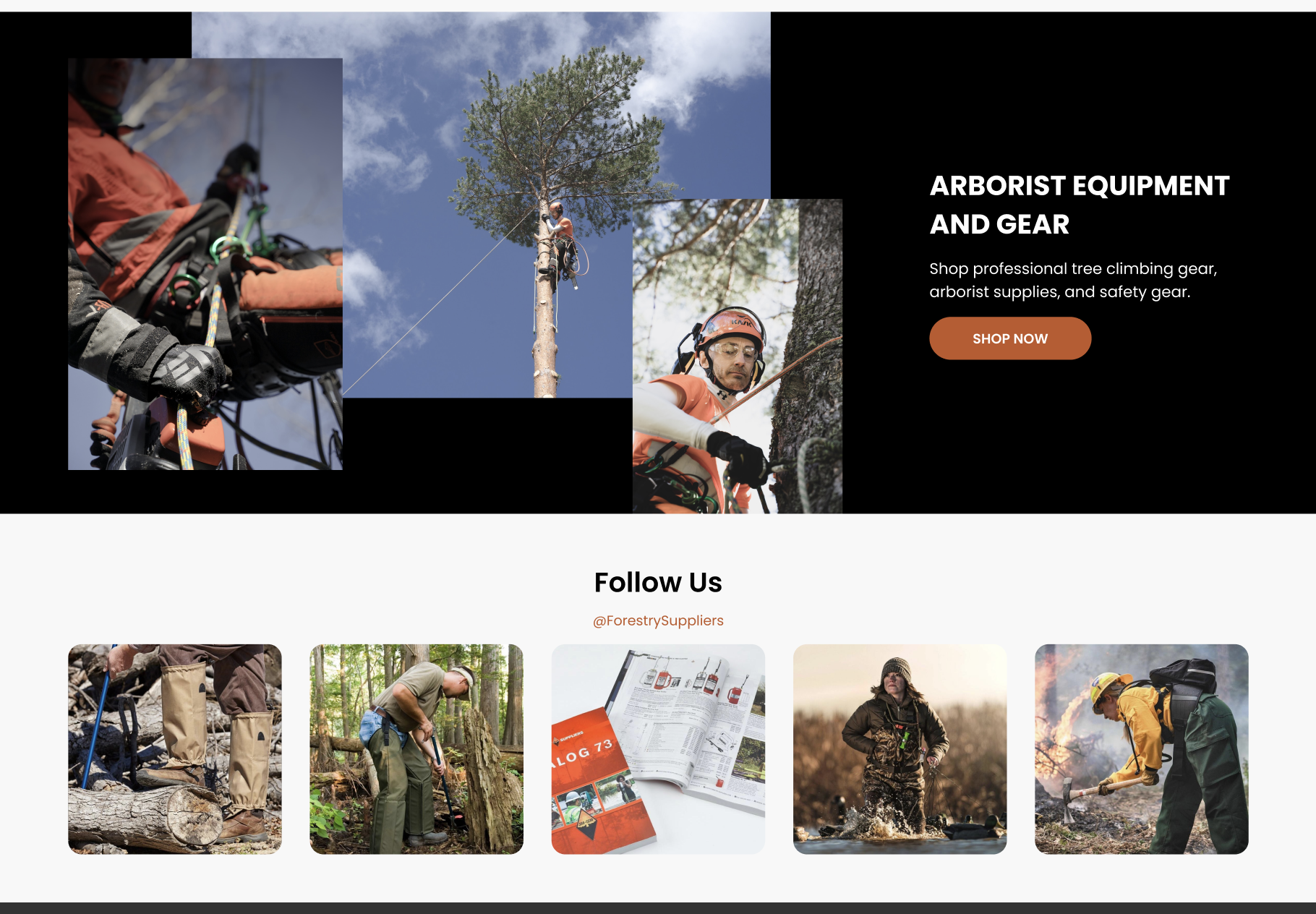
This strategy of embracing simplicity without compromising functionality mirrors a philosophy that less is indeed more. By avoiding the clutter of unnecessary elements, the website directs focus to what truly matters: the products and the Forestry Suppliers’ promise of quality. This level of clarity and simplicity does not merely serve aesthetics; it translates into tangible benefits for the user, from reduced cognitive load to quicker load times, culminating in a smoother, more enjoyable shopping experience.
Accessibility has been another cornerstone of the redesign. In a world where inclusivity can no longer be an afterthought, ensuring that the website is navigable by all, regardless of ability, is not just ethical; it’s good business. By acknowledging this, Forestry Suppliers reaffirm their commitment to serving every customer with equal care and consideration.
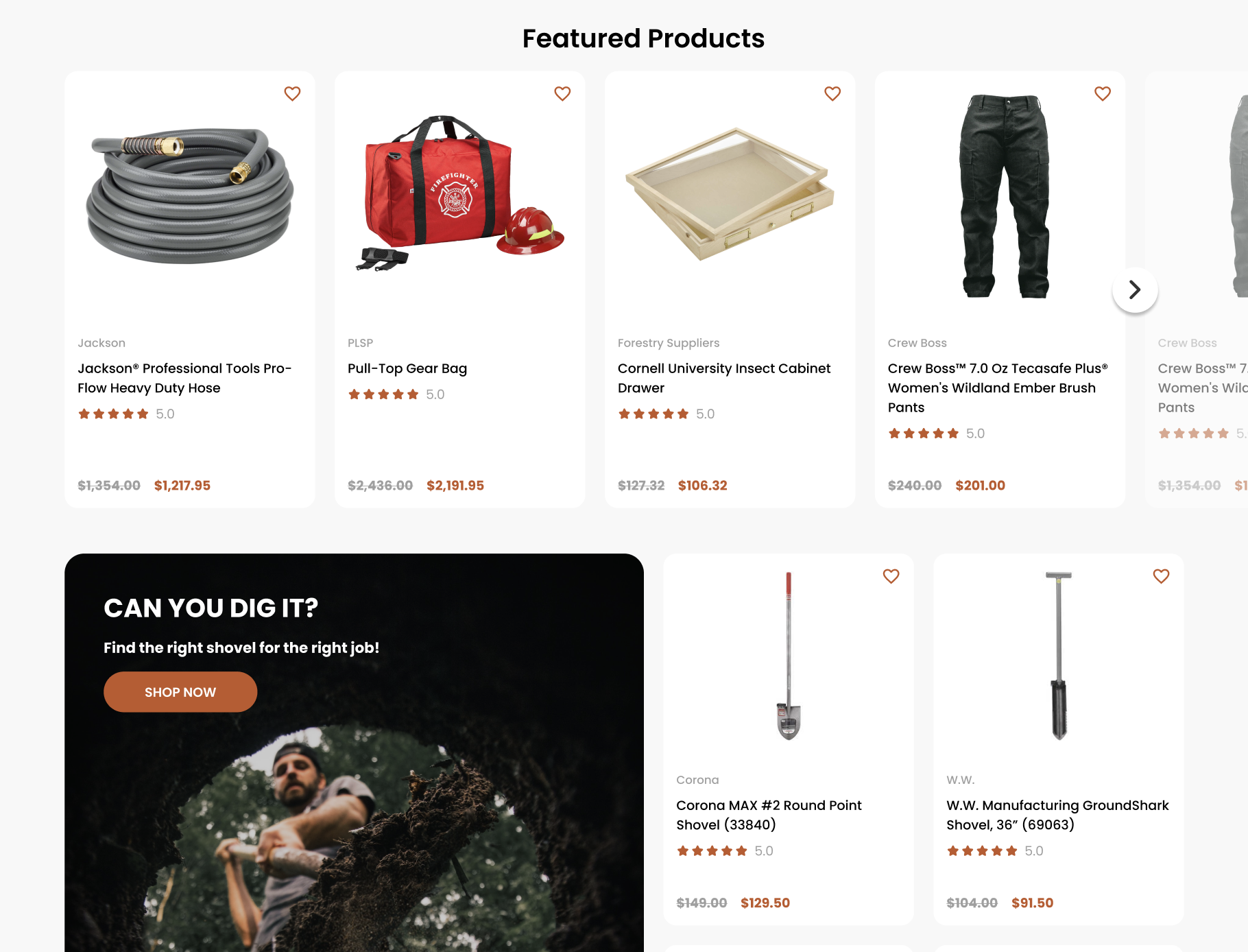
Finally, the homepage now leverages the art of the value proposition. Offers and prices are not just displayed; they are showcased through compelling visuals and succinct messaging that capture the essence of Forestry Suppliers’ market offerings. This is the hook that not only grabs attention but also anchors the brand in the minds of the consumers.
In this light, the homepage redesign of Forestry Suppliers is not just a blueprint for modernization. It stands as a testament and a call to action for businesses vested in longevity. A reminder that in the digital domain, evolution is not an option but a necessity to thrive. Through this comprehensive redesign, Forestry Suppliers Inc. has not only equipped themselves for today’s market demands but has also laid down the gauntlet for outdated websites everywhere to step into the new age.
Enhancing Interactivity: Quick View and Hover Effects
Interactivity on a website is akin to the engaging demeanor of a skilled salesperson in a brick-and-mortar store. It’s not just about responding to customer queries but anticipating needs and providing information in the most efficient way possible. The incorporation of Quick View and hover effects on the redesigned Forestry Suppliers website transforms passive browsing into an active exploration.
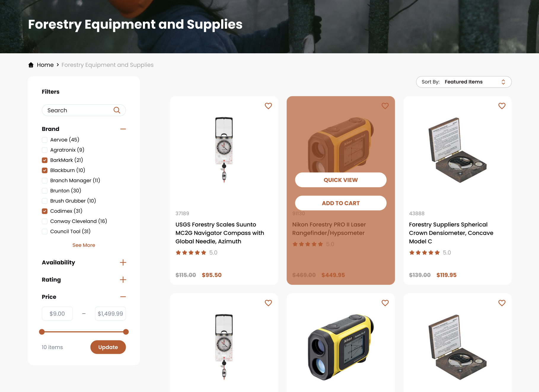
Quick View functionality is a decisive step towards respecting the modern customer’s most valuable resource—time. This feature allows customers to glimpse the essence of a product without the commitment of a full page load. It’s a digital nod of acknowledgement to the fast-paced user, providing a snapshot of essential information and facilitating quicker decision-making. The seamless integration of this feature also helps in reducing the often frustrating back-and-forth navigation that can mar an otherwise smooth shopping experience.
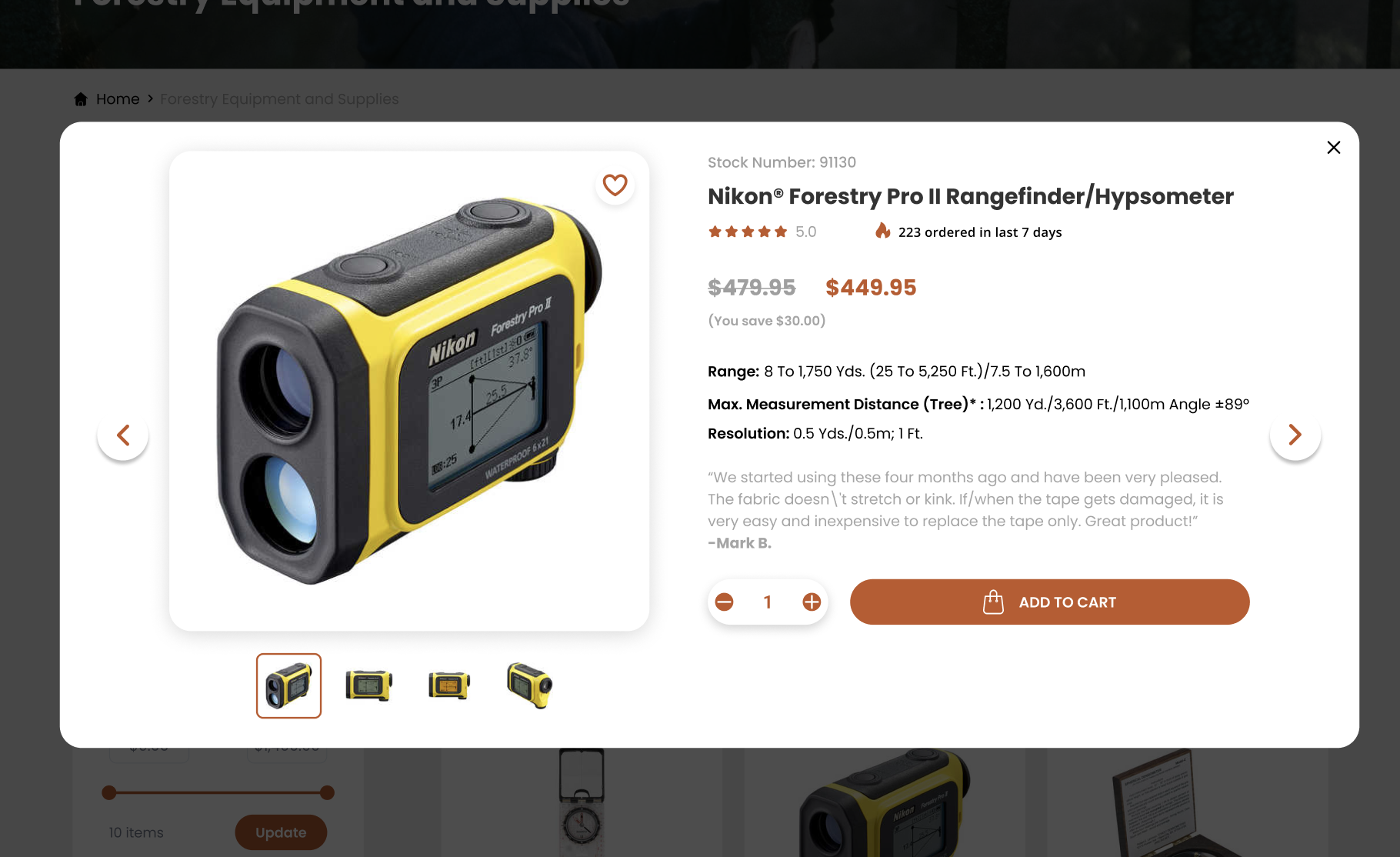
Hover effects play a subtler, yet no less significant role. As a user traverses the digital landscape of products, hover effects provide immediate visual feedback that not only confirms their actions but also delights the senses. It’s the equivalent of items on a shelf subtly shining as they catch your eye, enticing you to take a closer look. This layer of interactivity is not merely decorative; it serves a practical function by clearly demarcating navigable items and enhancing the usability of the website.
Seamless Navigation: Introducing the Mega Menu
As an e-commerce entity grows and diversifies its offerings, the challenge of navigation becomes increasingly complex. This is where the mega menu comes into its own as a sophisticated solution that marries a breadth of information with ease of access. On forestry-suppliers.com, the introduction of the mega menu is a pivotal moment in the website’s evolution.
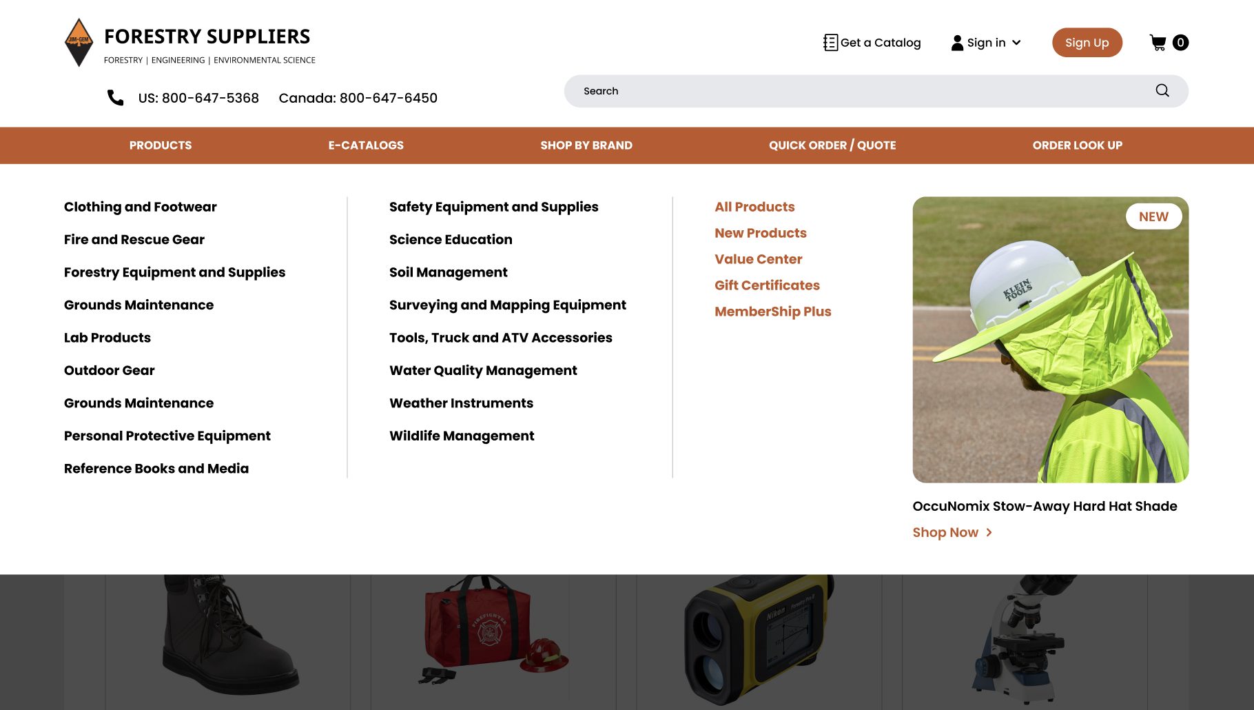
The mega menu is not just an upgrade; it is a reimagining of how users find their way through an extensive catalog of products. Compared to traditional dropdown menus, which can become unwieldy with growth, mega menus provide a panoramic view of the available categories and items, allowing users to pinpoint their destination with surgical precision. The result is a reduction in the time spent searching for products and an increase in the time spent engaging with them.
Moreover, the mega menu has been engineered to not only guide users but also to showcase the breadth and depth of Forestry Suppliers’ offerings. It’s a powerful tool for discovering new products and unearthing possibilities that may have remained hidden within the confines of a conventional menu structure. The design is intentional, focusing on promoting relevant products without overwhelming the shopper, ensuring a satisfying balance between functionality and aesthetics.
The introduction of the mega menu signifies a leap forward in user experience, acting as both a map and a compass for navigating the rich forest of Forestry Suppliers’ inventory. By implementing such a feature, the website becomes an empowering space for customers, encouraging exploration without the fear of getting lost. It is an example of how thoughtful design can simplify complexity, a quality that all websites with a wide array of products should aspire to emulate.
Category Pages: Maximizing User Engagement
In the realm of e-commerce, the category page is where the magic happens—it’s the bustling marketplace where customers browse the shelves. For Forestry Suppliers, enhancing these digital shelves meant creating a space that not only displays products but also invites interaction and engagement.
Recognizing that a staggering 43% of visitors head straight to the search bar, the focus was placed on developing an interactive and intuitive search interface. The revamped category pages now offer an immersive experience that is both aesthetically pleasing and highly functional. This approach serves a dual purpose: catering to the user’s search intent while providing an environment that encourages further exploration.

Interactive filters have been introduced to break down the barrier between the customer and the products they seek. These filters are the digital equivalent of a knowledgeable sales assistant who can instantly sort items according to the shopper’s preferences. The immediate, responsive filtering allows customers to tailor their browsing experience in real-time, greatly enhancing engagement. The integration of these filters, which have been shown to increase conversions by 26%, represents a commitment to understanding and addressing the customer’s journey through the forest of available options.
The redesign of the category pages goes beyond mere aesthetics; it’s a strategic enhancement that puts the user’s desires at the forefront, creating a clear and pleasant path to their destination. By presenting a variety of products in an accessible and user-friendly manner, these pages not only facilitate a satisfying shopping experience but also encourage visitors to spend more time on the site, potentially discovering products they hadn’t initially considered.
Trust and Conversion: Refining Product Pages
The product page is where trust is built and decisions are made. For Forestry Suppliers, the redesign of product pages was not just a facelift—it was a trust-building exercise. By incorporating verified product ratings and clear evidence of product authenticity and quality, the website now provides a foundation for confidence in the shopper’s decision-making process.
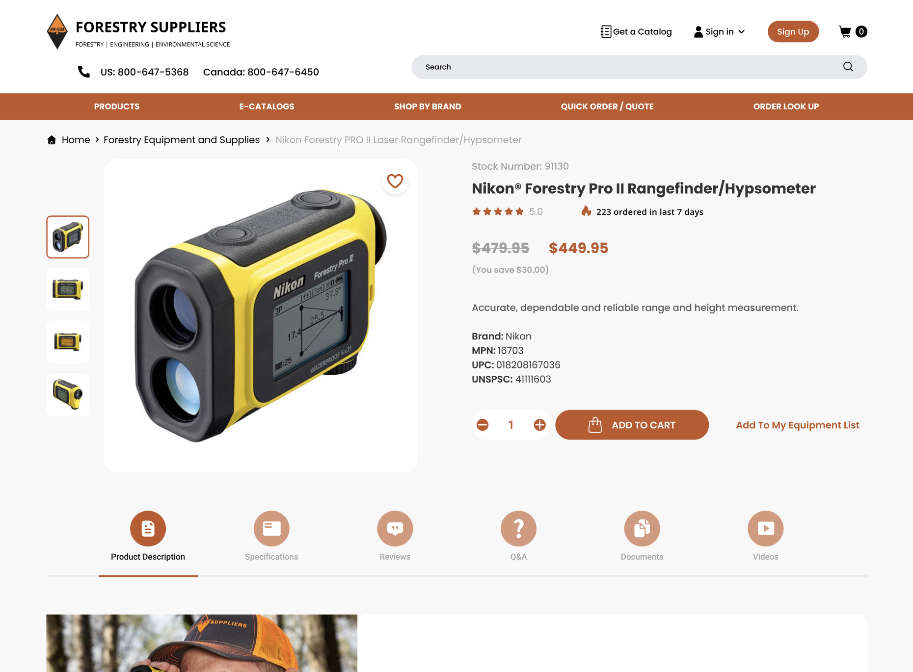
This transparency is crucial in converting browsers into buyers. Presenting product highlights and features in a concise manner addresses the user’s need for information without overwhelming them. It’s a delicate balance that requires a deep understanding of how customers interact with product pages—too much information can be as detrimental as too little.
To further enhance trust and encourage conversions, strategic recommendations for up-selling and cross-selling were introduced. This is a subtle art, akin to a personal shopper suggesting accessories to complement a chosen outfit. By showing customers higher-quality alternatives or complementary products, Forestry Suppliers gently guides them towards making a purchase that will enhance their overall satisfaction.
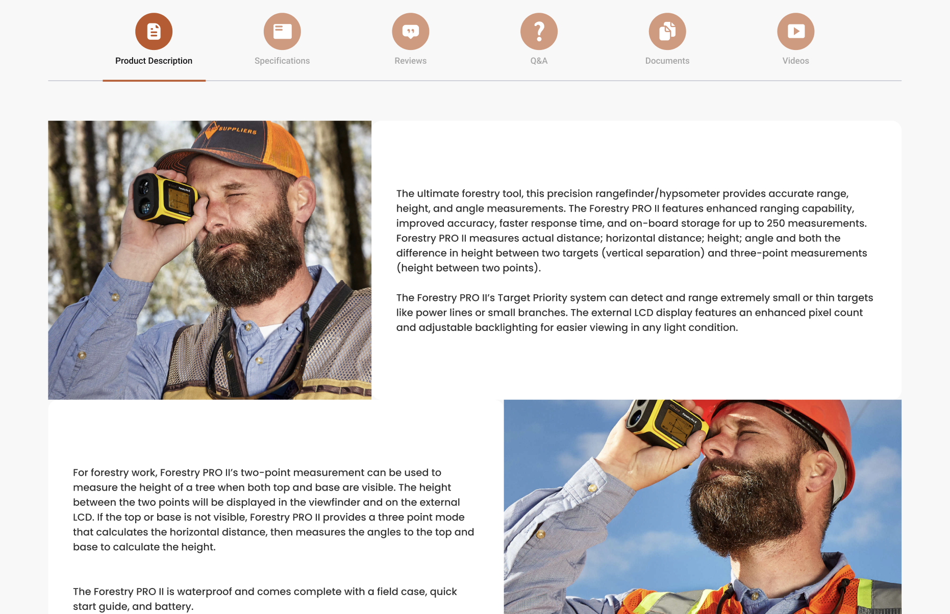
The thoughtful redesign of product pages demonstrates a commitment to providing a customer-centric shopping experience. It’s an acknowledgment that trust and transparency are paramount in the online marketplace. These changes are not just beneficial for Forestry Suppliers but serve as an exemplar for other e-commerce businesses. They illustrate that improving user experience and building customer trust is not just a trend but a timeless aspect of online retail that can significantly impact a company’s bottom line.
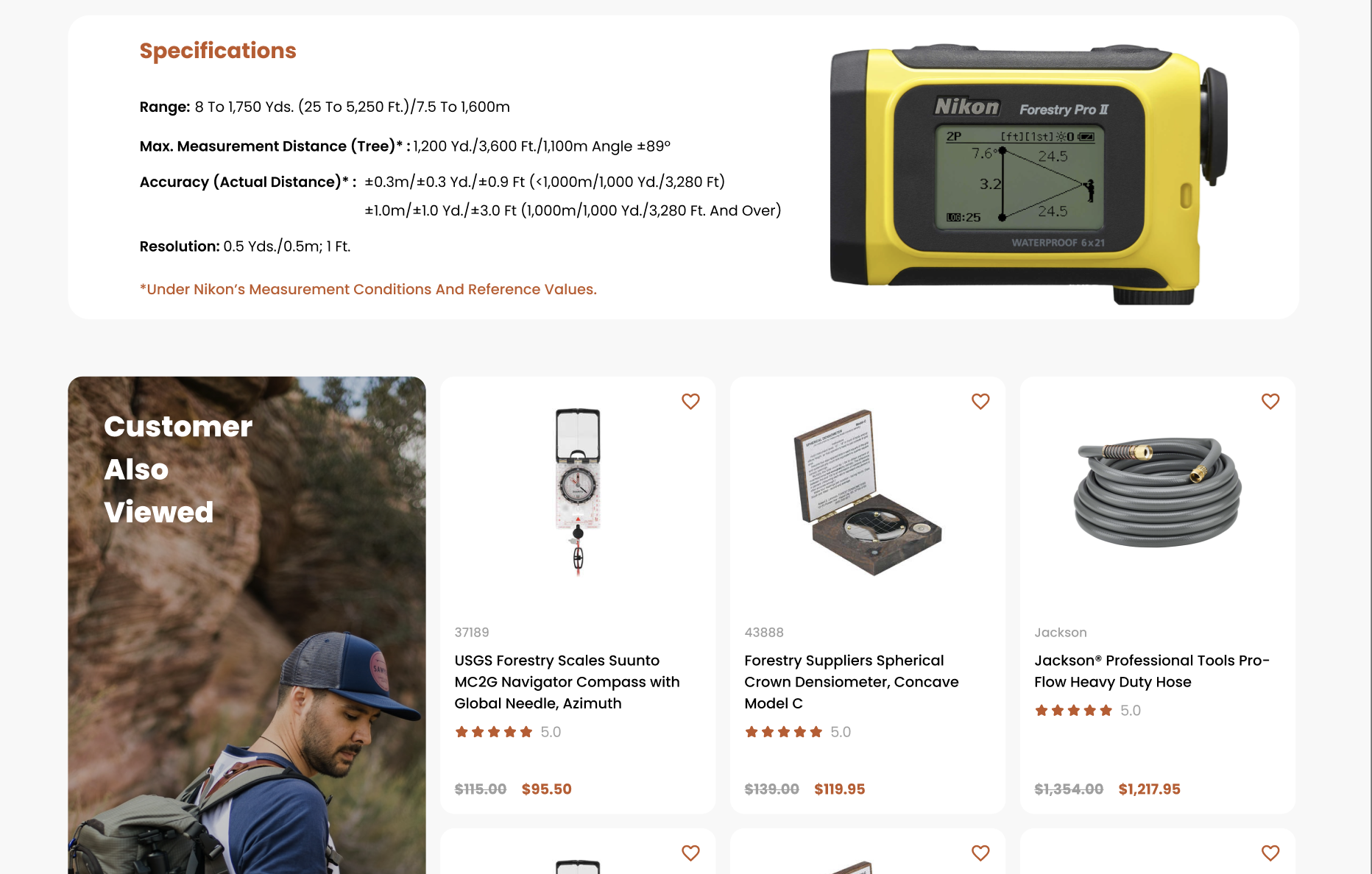
In both the strategic development of category pages and the trust-oriented refinement of product pages, the Forestry Suppliers’ website redesign reflects a profound understanding of the modern consumer’s online behavior. These enhancements exemplify the importance of evolving with the times and adopting a user-focused approach to design. It’s a call to action for all online entities still clinging to outdated interfaces to reconsider their online presence—not as a superficial update, but as a fundamental strategy to thrive in a competitive digital ecosystem.
The Sticky Add-to-Cart Feature
The Sticky Add to Cart feature is akin to a personal shopping assistant who diligently follows you around, ready to swiftly facilitate your purchase the moment you make your choice. It’s a small yet powerful tweak in the e-commerce experience that Forestry Suppliers has embraced with open arms. This omnipresent button is a subtle, yet continuous, invitation to finalize a purchase, and it’s revolutionizing the way users interact with the product page.

Imagine this: as a customer scrolls through the rich details of a rugged outdoor jacket, learning about its water-resistant fabric and reading through customer reviews, the option to add this essential gear to their cart remains ever-present, floating alongside the product imagery and information. This constant visual cue not only simplifies the buying process but also significantly reduces the friction that can occur when a user must scroll back and forth, searching for the add-to-cart button. In a digital environment where every second counts, this seamless approach to shopping cart design has proven its worth, boasting an impressive 8% increase in orders.
The Sticky Add to Cart bar is not just a convenience; it’s a carefully considered component of the user experience that reflects an understanding of customer behavior and preferences. Its impact is twofold: it streamlines the user journey from interest to purchase, and it serves as a constant, gentle reminder of the user’s intent to buy, effectively nudging them towards conversion without being obtrusive.
Conclusion
The journey through the redesigned landscape of Forestry Suppliers’ website is more than a mere walkthrough of new features—it’s a testament to the transformative power of user-centered design. The thoughtful updates, from the interactive category pages to the trust-inducing product details, and the innovative Sticky Add to Cart functionality, all contribute to a holistic, engaging, and ultimately satisfying user experience.
This redesign narrative isn’t just about a single website’s evolution; it’s a clarion call to all online businesses that are yet to embrace the winds of change. It serves as a compelling case study demonstrating that thoughtful design aligned with user needs can drive engagement and sales. It reaffirms that, in the ever-shifting sands of the digital marketplace, standing still is not an option. Those with outdated websites should view this not as a critique but as an inspiration to reimagine their online presence.
If you’re inspired to explore what a redesigned website could do for your business, to spark new levels of engagement and drive growth, we invite you to reach out. Contact us, and together, let’s craft a digital experience that your users will love, remember, and return to.


