The e-commerce landscape is a blend of rapid evolution and ever-shifting consumer expectations. Established in 1984, CutleryShoppe.com has stood the test of time, not just due to its high-quality offerings but also its agility in embracing the digital metamorphosis. This recent redesign is an emblem of the brand’s adaptability, ensuring CutleryShoppe.com remains fresh, user-centric, and at the forefront of its competition.
Redesigning is more than a visual overhaul. It’s about recalibrating the user experience, streamlining access to information, and ensuring the digital interface is both operational and aesthetically aligned with modern sensibilities. For businesses with a legacy, like CutleryShoppe.com, periodic refreshes signal a commitment to current and prospective customers, assuring them of a premium online shopping journey.
The Power of the Homepage
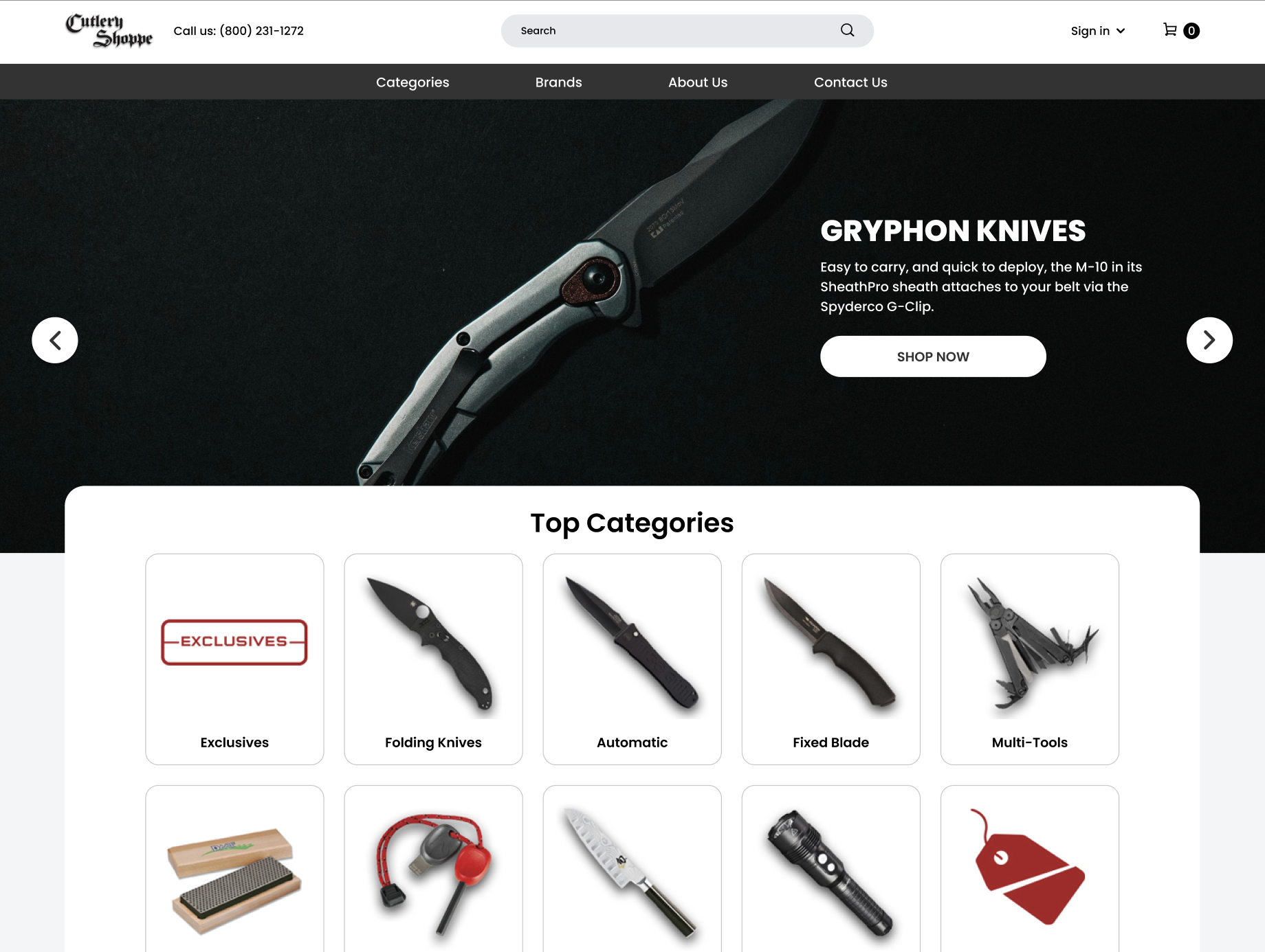
The homepage is akin to a store’s main entrance, influencing first impressions and shaping ensuing interactions.
The Significance of the Header Banner
Walking into a store, one is often met with a captivating display that outlines the brand’s latest offerings and ethos. In the digital space, the header banner shoulders this responsibility. For CutleryShoppe.com, this redesigned banner isn’t a mere design element; it’s a brand proclamation. It offers visitors a snapshot of the brand’s identity, setting the stage for their browsing journey.
User Interface: The Road to Retention
In a world teeming with digital options, a sleek and responsive user interface can be the difference between fleeting visits and loyal patronage. CutleryShoppe.com’s rejuvenated interface is a nod to modern user expectations. It not only ensures seamless browsing but also fosters trust, portraying a brand’s commitment to excellence and its customers.
The Impact of Banner Ads
Banners, when employed thoughtfully, do more than advertise; they engage and guide. Their strategic placement can mold the user journey, nudging visitors to explore and ultimately, commit to a purchase.
Accessibility for All
A modern website is an inclusive platform, accessible to all, irrespective of technological prowess. The redesigned CutleryShoppe.com champions this principle, ensuring each user enjoys a frictionless experience.
The Power of a Strong Value Proposition
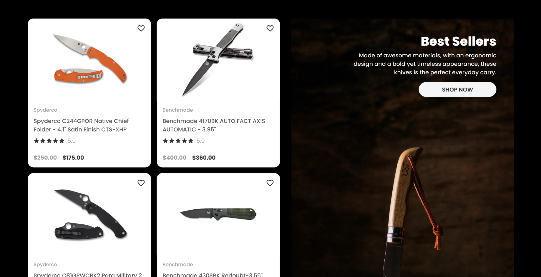
Highlighting value propositions effectively is akin to a store’s prime display. On CutleryShoppe.com, enticing offers and distinctive product attributes are spotlighted, engaging visitors without an overt sales push.
Enhancing User Experience with Quick View and Hover Effects
Today’s digital consumers crave seamless and intuitive interactions. They desire to extract maximum information with minimum effort, seeking quick gratifications. Understanding this pulse of the audience, CutleryShoppe.com has embraced enhancements that significantly elevate user experience: Quick View and Hover Effects.
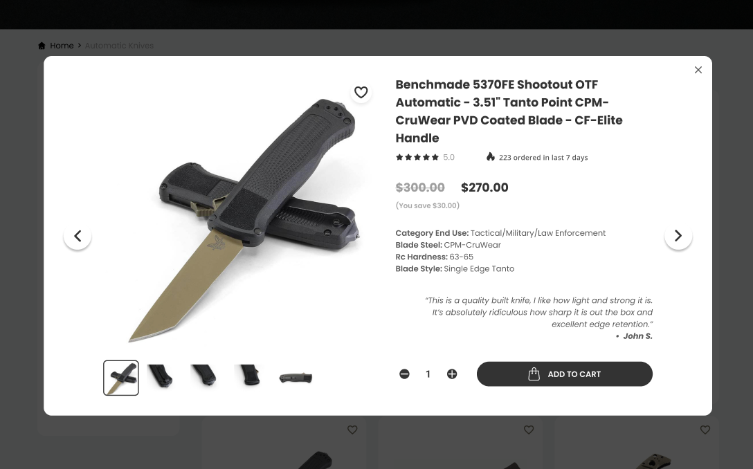
Quick View has reshaped the e-commerce browsing experience. Imagine walking into a physical store and instantly being handed the most crucial details of a product, without having to turn the item around or ask a salesperson. Quick View mirrors this, allowing users to glean essential product information without delving deep into individual product pages. This feature especially shines for those customers on a multi-product quest, streamlining their journey and saving precious time.
But what beckons users to use the Quick View? Here’s where Hover Effects come into play. These subtle animations breathe life into the webpage elements. A button might change color or a product image might zoom in slightly, all signaling interactivity. Such elements not only affirm that the website is responsive but also make the browsing journey enjoyable. There’s an undeniable satisfaction in seeing a webpage respond to one’s actions in real-time.
Navigational Excellence with Mega Menus
The beauty of walking into a well-organized store lies in the ease with which one can find desired sections or products. Everything has its designated space, labeled and arranged for maximum convenience. This physical store experience is what Mega Menus aim to replicate in the digital realm.
A menu is the compass of a website. Especially for e-commerce platforms with a plethora of product categories, a traditional dropdown menu can quickly become an overwhelming labyrinth. CutleryShoppe.com’s transition to Mega Menus is a game-changer in this aspect. Instead of bombarding users with a cascading list of options, Mega Menus present information in a spacious, organized manner. It’s akin to walking into a store with clear aisle markers and section boards.
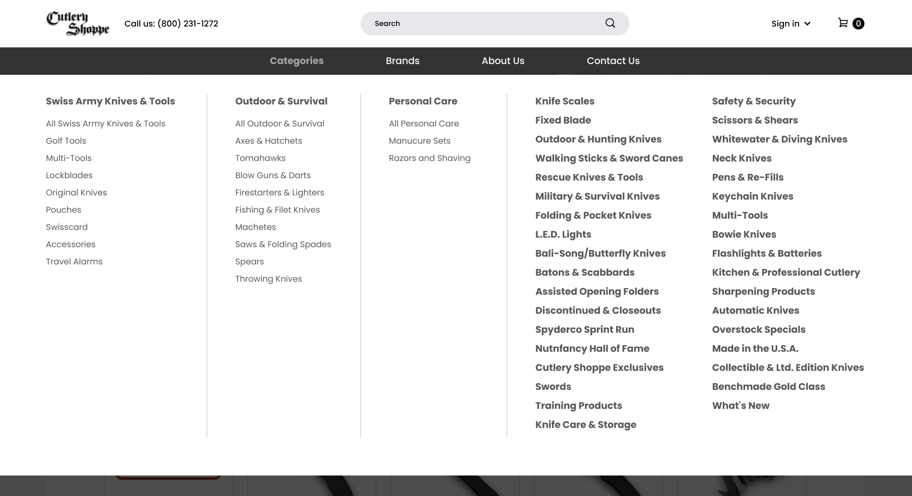
For businesses with extensive offerings, Mega Menus are not just a choice; they’re a necessity. They declutter the navigational space, highlight important product categories, and seamlessly guide users to their desired destinations. In essence, they transform the menu from a mere tool to an integral part of the user experience.
Incorporating such features as Quick View, Hover Effects, and Mega Menus is not about keeping up with digital trends but about understanding and catering to evolving user expectations. CutleryShoppe.com’s redesign underscores a crucial lesson for digital platforms: An adaptable, user-centric approach is key to sustainable success. As the digital landscape continually shifts, businesses must proactively assess and refine their interfaces, not as a nod to trends but as a commitment to their users.
Optimizing Category Pages for Better Conversions
At the core of a thriving e-commerce website is the experience it delivers to its visitors. Think of it like walking into a meticulously organized store versus one in disarray. The former entices you to explore, while the latter makes you want to exit. This is the essence of category pages on an e-commerce site.
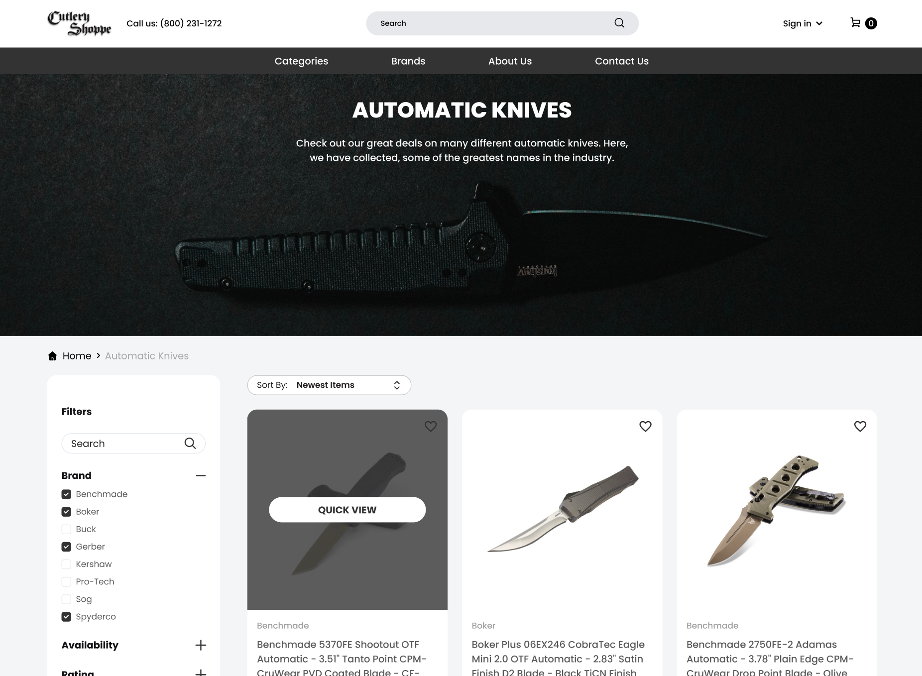
Forrester’s research sheds light on a vital behavior: almost half of website visitors are drawn to the search bar as soon as they land on an e-commerce platform. This isn’t just a casual browse; it signifies a purpose. They are on a mission, and a well-optimized category page can be their best ally.
CutleryShoppe.com has tapped into this insight masterfully. The redesigned category pages aren’t just grids of products; they’re finely curated experiences. In the realm of e-commerce, where choices are aplenty, the power of a comprehensive filtering system is indispensable. Such systems aren’t just design enhancements; they’re the backbone of user navigation. Efficient filters not only refine the user journey but are also potent tools that drive conversions. The ability to swiftly pinpoint desired products directly correlates with increased sales and heightened user satisfaction.
Perfecting the Product Page for Maximized Trust and Sales
If category pages are the corridors of an e-commerce store, product pages are the individual aisles where decisions crystallize. It’s the online space where a customer closely inspects, evaluates, and connects with a product. Thus, crafting a product page that resonates with authenticity and provides lucid information is pivotal.
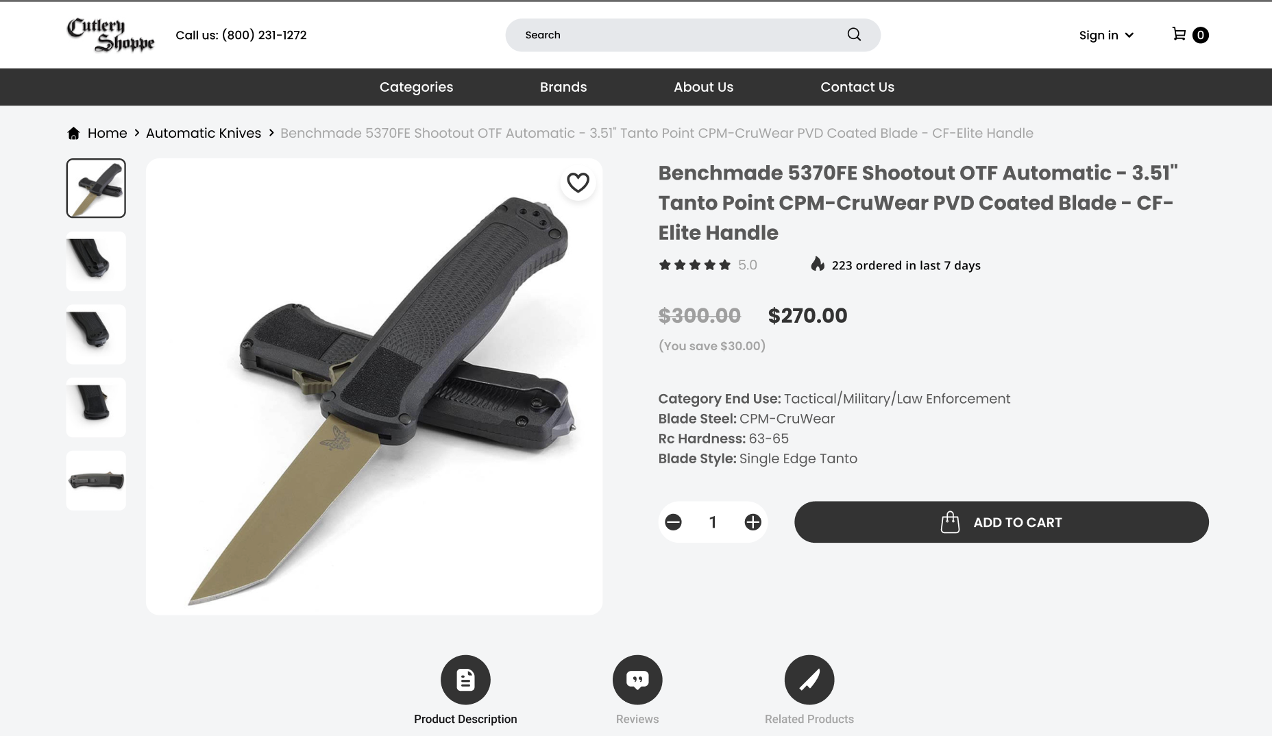
Taking a leap in this direction, CutleryShoppe.com’s rejuvenated product pages champion genuine interaction and lucidity. With the stamp of verified product ratings, customers receive an unspoken assurance, a testament to the product’s integrity and quality. By presenting product attributes in a concise yet informative manner, the design ensures that customers are well-equipped with knowledge, fostering confident purchase decisions.
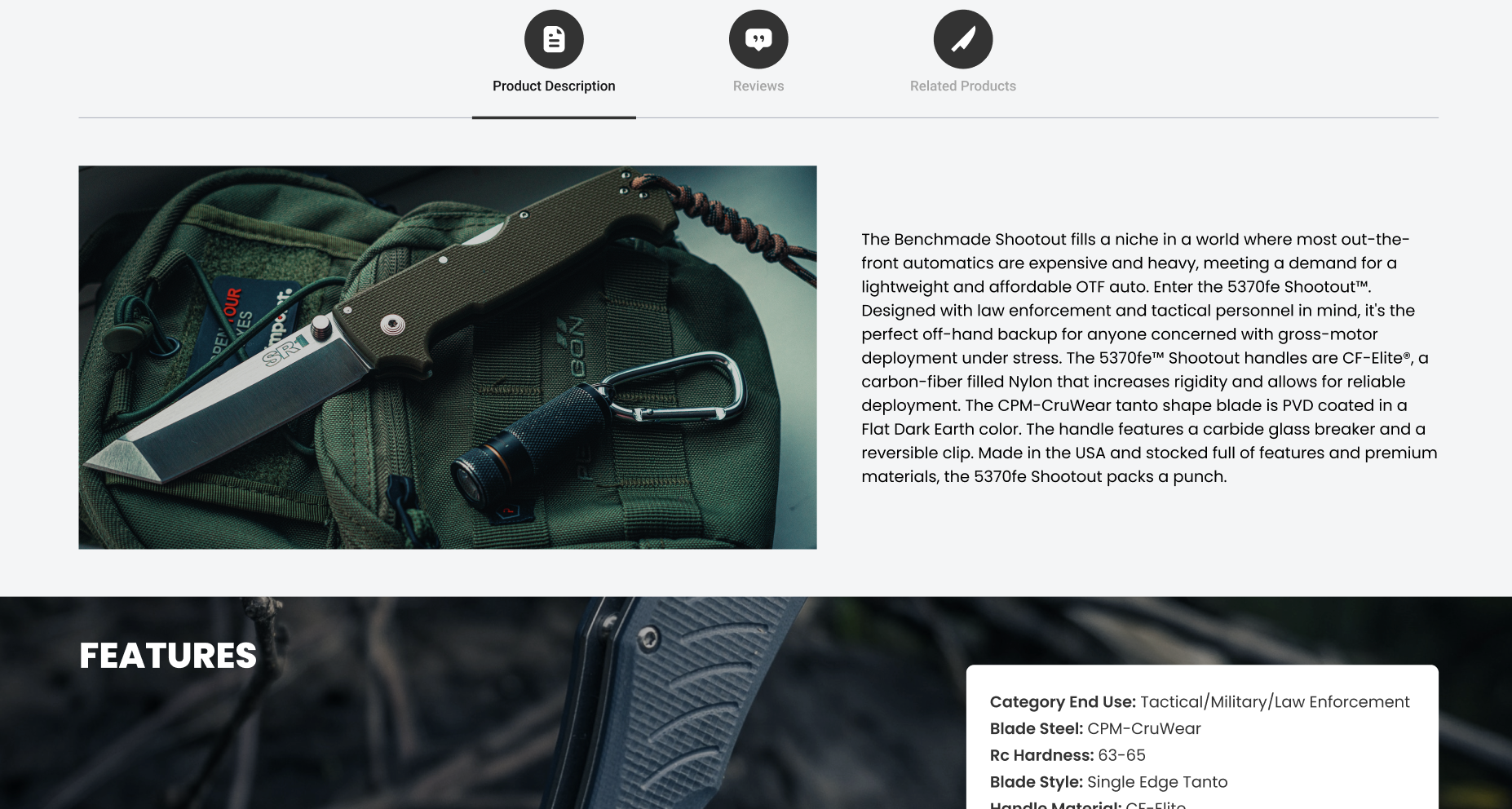
The genius, however, lies in the finesse with which up-sell and cross-sell opportunities are interwoven. Eschewing hard-sell tactics, CutleryShoppe.com opts for a more consultative approach. By suggesting complementary products or superior alternatives, the experience is reminiscent of a seasoned store consultant guiding you. This delicate balance between information and recommendation cultivates trust while potentially enhancing the value of each sale.
The Sticky Add-to-Cart Phenomenon
In the rapidly advancing world of e-commerce, staying ahead means continuously refining the user experience. Often, this refining process is about understanding user behavior and aligning website functionality to it. One such innovative approach is the Sticky Add to Cart feature, an elegantly simple concept that has profound implications for user engagement and conversion.

At its core, the Sticky Add to Cart button is akin to having a silent, non-intrusive shopping assistant shadowing you discreetly. Picture yourself in a physical store. You’re inspecting a product, perhaps mulling over its features, and benefits, and reading its label. And just as you’re about to decide, an assistant is right there to take the product to the counter for you. The Sticky Add to Cart emulates this efficiency. As users explore product details, scroll through reviews, or delve deeper into product specifications, the button remains subtly persistent, ensuring that the path to purchase is always a click away.
CutleryShoppe.com has seamlessly integrated this feature, and it’s more than just a stylistic choice. In the vast ocean of digital content, small tweaks often make significant waves. By keeping the purchase option constantly accessible, it eliminates trivial inconveniences like scrolling back to the top, ensuring users are always a step closer to sealing the deal. A noteworthy impact? An 8% increase in orders. Such numbers don’t just hint but scream effectiveness.
Conclusion
In today’s digital age, with countless websites vying for user attention, it’s not just about being present but about being impactful. CutleryShoppe.com’s in-depth redesign is a testament to this philosophy. It’s a vivid demonstration of how an intuitive, user-centric design can radically transform both the user experience and the brand’s bottom line.
From the magnetic allure of the homepage that entices at first glance to the practical brilliance of the Sticky Add to Cart feature, every design decision has been made with the user in mind. The site isn’t merely a digital storefront; it’s an experience, an evolution tailored for today’s discerning digital consumer.
This journey of CutleryShoppe.com is not just an inspirational tale for brands in the e-commerce space but a clarion call for all businesses. In the dynamic realm of digital commerce, resting on laurels isn’t an option. The redesign is less about change for the sake of change and more about adapting to meet the ever-evolving demands of the digital consumer.
For those businesses still tethered to outdated designs, or those hesitant about embracing change, the metamorphosis of CutleryShoppe.com is a beacon. It reiterates that in this digital age, growth is synonymous with evolution. Standing still is moving backward.
Are you pondering over your digital journey? Looking to reimagine your digital presence or just eager to learn more about our design philosophy? Dive deeper into the world of user-centric design with us. Contact us today, and let’s chart a course for your digital future together.


