
A digital marketing strategy is the path to profitability. Optimum7 can help you set the right goals, offer and implement creative and technical strategies, and use data and analytics to review and improve your business’s performance.


Paws & Whiskers sells premium pet wellness products through its WooCommerce store, offering one-time purchases and subscriptions. Pet owners need to understand a product’s ingredients and dosing requirements to see how it fits into their pet’s daily care routine, so the storefront plays an important role in product selection. Our engagement covered conversion rate optimization across the existing store, using the GeneratePress theme and Elementor page builder.
Help more Paws & Whiskers shoppers complete a purchase by addressing friction across the existing WooCommerce store. The work also focused on making subscription savings and complementary products easier to discover.
Each of these sat at a different point in the shopping journey, and all of them had the same effect: customers had to work harder than necessary to reach checkout.
Paws & Whiskers had several reasons for customers to trust its products, including veterinary credibility and a money-back guarantee. These details needed greater prominence early in the visit, and repeated badges elsewhere crowded the page.
Customers considering a one-time order needed a clearer comparison of subscription pricing and savings before committing to recurring delivery.
Reading through product details took shoppers beyond the main purchase area. Competing “Buy Now” and “Add to Cart” buttons complicated the next step, and adding an item redirected customers away from the product page.
The cart’s oversized header and lengthy product names consumed space on smaller screens. Secondary payment links and navigation added distractions around checkout. Shipping incentives and product recommendations also needed room, which called for a more deliberate layout to keep order details and the checkout button easy to find.
The central challenge was deciding how much to present at each stage. Subscription prompts and cross-sells gave customers useful options, and their placement had to preserve a clear route to purchase. We used the purpose of each page to guide those decisions, keeping product education in the browsing experience and narrowing the focus as customers approached payment.
We addressed friction in the order customers actually meet it: homepage, then shop and product pages, then cart and checkout, with mobile treated as its own pass across all of it.
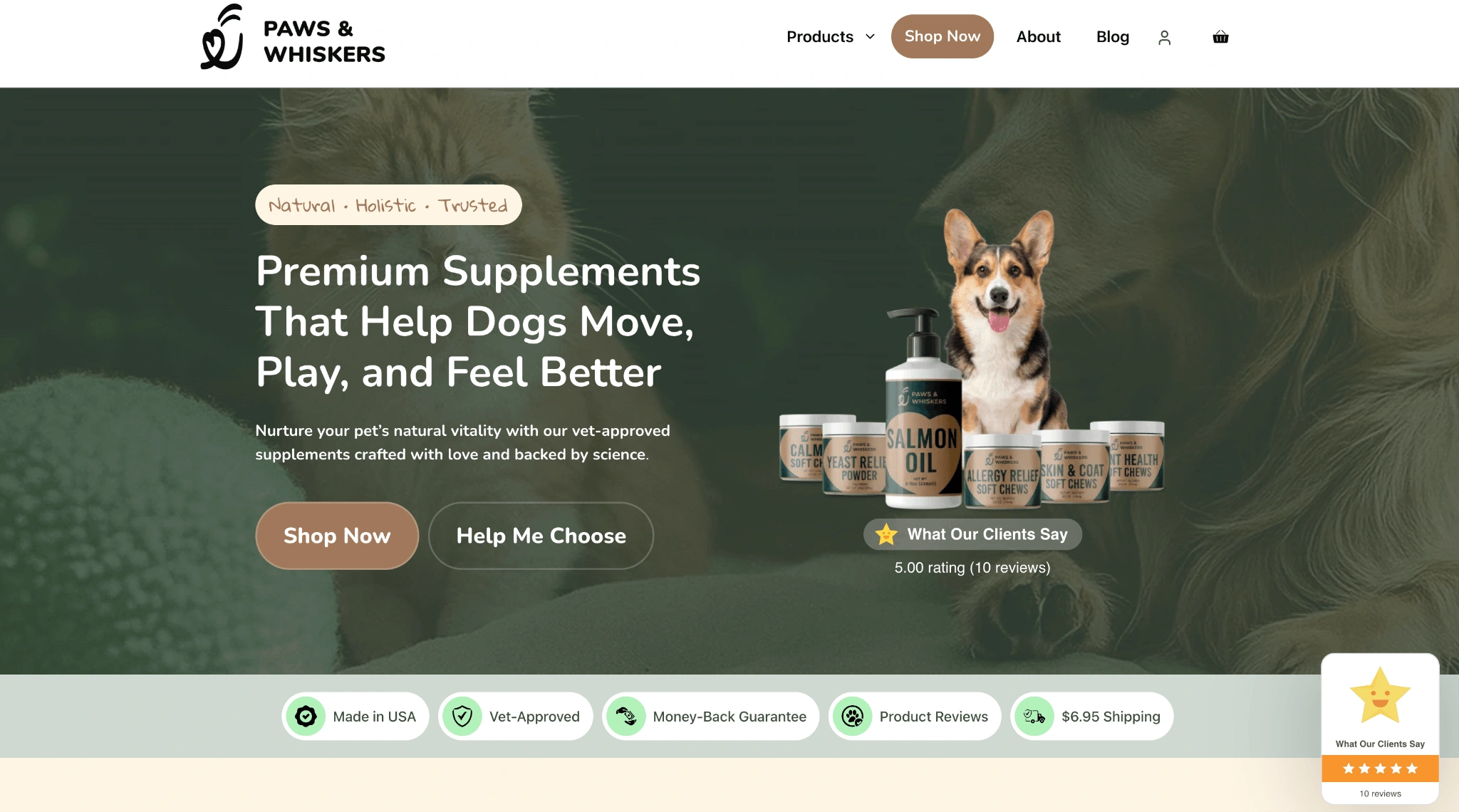
The revised hero introduced the products with a primary “Shop Now” button and a “Help Me Choose” option for visitors seeking guidance. Customer ratings appeared above the fold alongside the money-back guarantee and “Made in USA / Vet-Approved” messaging. A sticky header kept the shop accessible as visitors scrolled. The email capture popup was redesigned around a first-order discount incentive and connected to the existing Klaviyo account.

Homepage rebuilt around trust signals and a clear primary call to action.
Product cards displayed pricing and subscription savings before customers opened a product page, with “Select options” buttons leading to the available purchase choices. Titles were standardized around product type, intended pet, benefit, and size to support Google Shopping feed requirements. An inline trust strip placed shipping and guarantee information alongside the catalog, and breadcrumbs gave visitors a visible route back through the store.
We reorganized the product pages around the questions pet owners consider before ordering. Information on ingredient sourcing and dosing appeared alongside veterinary formulation details, shipping and return information, and FAQs. Removing the redundant “Buy Now” button and repeated trust badges gave the main purchase action more space.

Product page reorganized around the questions pet owners ask before ordering.
A sticky add-to-cart bar and a side-drawer cart let shoppers select quantities, add products, and review their cart without leaving the product page.

A persistent add-to-cart bar keeps purchasing within reach at every scroll position.
Subscription options highlighted recurring savings, with a contextual reminder when a one-time purchase was selected. Companion product recommendations appeared below the purchase area and inside the cart drawer.

Subscription savings emphasized at the point of selection.
The revised cart displayed today’s total and recurring charges alongside a free-shipping progress bar, with customer reviews and guarantee details supporting order review before checkout. Cart and checkout cleanup removed secondary payment links and the order-note field. Express payment options were enabled on product and cart pages, and checkout retained a logo-only header with security and trust information in the footer.
Layouts and controls were adapted for iPhone and Android screen sizes, with attention to text readability and the space available for product details. In the cart, removing the oversized header gave order details more room. Shortened product names prevented awkward wrapping, and adjusted typography and spacing made individual items easier to review before payment.

Mobile layouts reworked across the full shopping journey.
Paws & Whiskers gives customers a clearer basis for choosing products and budgeting for ongoing care. Subscription savings and relevant companion products are presented as customers make that decision, supporting the brand’s goals of encouraging repeat purchases and helping customers discover more of its range. The cart and checkout changes shortened the distance between interest and purchase, with fewer competing actions and clearer order details at the point customers are ready to pay.
Paws & Whiskers completed a storewide CRO update using the platform its team already manages. Future work can focus on testing offers and product pairings, with customer response guiding where to invest next.
We built these changes inside the WooCommerce, GeneratePress, and Elementor setup Paws & Whiskers already runs, with no new platform or dependency to maintain. The team keeps full control of the store, with a shorter, clearer path from homepage to checkout already in place to build on.
Fill out the form to request a Custom Marketing or Conversion Optimization Strategy for your Website.